

CSS
INTRODUCTION TO CSS
CSS is the language we use to style an HTML document.
CSS describes how HTML elements should be displayed.
This tutorial will teach you CSS from basic to advanced.
WHY CSS..?
background-color: lightblue;
}
h1 {
color: white;
text-align: center;
}
p {
font-family: Verdana;
font-size: 20px;
}
CSS SYNTAX:

The selector points to the HTML element you want to style.
The declaration block contains one or more declarations separated by semicolons.
Each declaration includes a CSS property name and a value, separated by a colon.
Multiple CSS declarations are separated with semicolons, and declaration blocks are surrounded by curly braces.
EX:
text-align: center;
}
pis a selector in CSS (it points to the HTML element you want to style: <p>).coloris a property, andredis the property valuetext-alignis a property, andcenteris the property value
CSS SELECTORS:
We can divide CSS selectors into five categories:
- Simple selectors (select elements based on name, id, class)
- Combinator selectors (select elements based on a specific relationship between them)
- Pseudo-class selectors (select elements based on a certain state)
- Pseudo-elements selectors (select and style a part of an element)
- Attribute selectors (select elements based on an attribute or attribute value)
CSS ELEMENT SELECTOR:
color: red;
}
The id of an element is unique within a page, so the id selector is used to select one unique element!
To select an element with a specific id, write a hash (#) character, followed by the id of the element.
EX:
#para1 {
text-align: center;color: red;
}
To select elements with a specific class, write a period (.) character, followed by the class name.
EX:
.center {
text-align: center;color: red;
}
text-align: center;
color: blue;
}
Look at the following CSS code (the h1, h2, and p elements have the same style definitions)
EX:
h1 {
text-align: center;color: red;
}
h2 {
text-align: center;
color: red;
}
p {
text-align: center;
color: red;
}
To group selectors, separate each selector with a comma.
EX:
h1, h2, p {
text-align: center;color: red;
}
HOW TO ADD CSS :
- External CSS
- Internal CSS
- Inline CSS
Each HTML page must include a reference to the external style sheet file inside the <link> element, inside the head section.
EX:
External Styles are defined within the <link> element, inside the <head> section of HTML Page.
<!DOCTYPE html>
<html><head>
<link rel="stylesheet" href="mystyle.css">
</head>
<body>
<h1>This is a heading</h1>
<p>This is a paragraph.</p>
</body>
</html>
The external .css file should not contain any HTML tags.
Here is how the "mystyle.css" file looks
mystyle.css
body {
background-color: lightblue;}
h1 {
color: navy;
margin-left: 20px;
}
The internal style is defined inside the <style> element, inside the head section.
EX:
Internal Styles are defined within the <style> element, inside the <head> section of HTML Page.
<!DOCTYPE html>
<html><head>
<style>
body {
background-color: linen;
}
h1 {
color: maroon;
margin-left: 40px;
}
</style>
</head>
<body>
<h1>This is a heading</h1>
<p>This is a paragraph.</p>
</body>
</html>
To use inline styles, add the style attribute to the relevant element. The style attribute can contain any CSS property.
EX:
Inline styles are defined within the "style" attribute of the relevant element
<!DOCTYPE html>
<html><body>
<h1 style="color:blue;text-align:center;">This is a heading</h1>
<p style="color:red;">This is a paragraph.</p>
</body>
</html>
Comments are ignored by browsers.
A CSS comment is placed inside the <style> element, and starts with /* and ends with */
SingleLine Comments:
/* This is a single-line comment */
p {color: red;
}
MultiLine Comments:
/* This is
a multi-linecomment */
p {
color: red;
}
HTML AMD CSS COMMENTS:
From the HTML tutorial, you learned that you can add comments to your HTML source by using the <!--...--> syntax.
<head>
<style>
p {
color: red; /* Set text color to red */
}
</style>
</head>
<body>
<h2>My Heading</h2>
<!-- These paragraphs will be red -->
<p>Hello World!</p>
<p>This paragraph is styled with CSS.</p>
<p>CSS comments are not shown in the output.</p>
</body>
</html>
background-color property specifies the background color of an element.}
- a valid color name - like "red"
- a HEX value - like "#ff0000"
- an RGB value - like "rgb(255,0,0)"
div {
background-color: lightblue;
}
p {
background-color: yellow;
}
opacity property specifies the opacity/transparency of an element. It can take a value from 0.0 - 1.0. The lower value, the more transparentbackground-color: green;
opacity: 0.3;
}
You learned from our CSS Colors Chapter, that you can use RGB as a color value. In addition to RGB, you can use an RGB color value with an alpha channel (RGBA) - which specifies the opacity for a color.
An RGBA color value is specified with: rgba(red, green, blue, alpha). The alpha parameter is a number between 0.0 (fully transparent) and 1.0 (fully opaque).
EX:
div {
background: rgba(0, 128, 0, 0.3) /* Green background with 30% opacity */
}background-image property specifies an image to use as the background of an element.By default, the image is repeated so it covers the entire element
}
background-image property repeats an image both horizontally and vertically.Some images should be repeated only horizontally or vertically, or they will look strange
EX:
body {
background-image: url("gradient_bg.png");}
background-repeat: repeat-x;), the background will look betterbackground-repeat: repeat-x;
}
background-repeat propertybackground-repeat: no-repeat;
}
background-position property is used to specify the position of the background imagebackground-image: url("img_tree.png");
background-repeat: no-repeat;
background-position: right top;
}
background-attachment property specifies whether the background image should scroll or be fixed (will not scroll with the rest of the page):background-repeat: no-repeat;
background-position: right top;
background-attachment: fixed;
}
background-image: url("img_tree.png");
background-repeat: no-repeat;
background-position: right top;
background-attachment: scroll;
}
background-image: url("img_tree.png");
background-repeat: no-repeat;
background-position: right top;
}
}
border-style property specifies what kind of border to display.The following values are allowed:
dotted- Defines a dotted borderdashed- Defines a dashed bordersolid- Defines a solid borderdouble- Defines a double bordergroove- Defines a 3D grooved border. The effect depends on the border-color valueridge- Defines a 3D ridged border. The effect depends on the border-color valueinset- Defines a 3D inset border. The effect depends on the border-color valueoutset- Defines a 3D outset border. The effect depends on the border-color valuenone- Defines no borderhidden- Defines a hidden border
The border-style property can have from one to four values (for the top border, right border, bottom border, and the left border).
EX:
p.dotted {border-style: dotted;}
` p.dashed {border-style: dashed;}p.solid {border-style: solid;}
p.double {border-style: double;}
p.groove {border-style: groove;}
p.ridge {border-style: ridge;}
p.inset {border-style: inset;}
p.outset {border-style: outset;}
p.none {border-style: none;}
p.hidden {border-style: hidden;}
p.mix {border-style: dotted dashed solid double;}
A dashed border.
A solid border.
A double border.
A groove border. The effect depends on the border-color value.
A ridge border. The effect depends on the border-color value.
An inset border. The effect depends on the border-color value.
An outset border. The effect depends on the border-color value.
No border.
A mixed border.
border-width property specifies the width of the four borders.The width can be set as a specific size (in px, pt, cm, em, etc) or by using one of the three pre-defined values: thin, medium, or thick:
EX:
p.one {
border-style: solid;
border-width: 5px;
}
p.two {
border-style: solid;
border-width: medium;
}
p.three {
border-style: dotted;
border-width: 2px;
}
p.four {
border-style: dotted;
border-width: thick;
}
Result:
border-width property can have from one to four values (for the top border, right border, bottom border, and the left border)}
p.two {
border-style: solid;
border-width: 20px 5px; /* 20px top and bottom, 5px on the sides */
}
p.three {
border-style: solid;
border-width: 25px 10px 4px 35px; /* 25px top, 10px right, 4px bottom and 35px left */
border-color property is used to set the color of the four borders.The color can be set by:
- name - specify a color name, like "red"
- HEX - specify a HEX value, like "#ff0000"
- RGB - specify a RGB value, like "rgb(255,0,0)"
- HSL - specify a HSL value, like "hsl(0, 100%, 50%)"
- transparent
border-color: red;
}
p.two {
border-style: solid;
border-color: green;
}
p.three {
border-style: dotted;
border-color: blue;
}
border-color property can have from one to four values (for the top border, right border, bottom border, and the left border). border-color: red green blue yellow; /* red top, green right, blue bottom and yellow left */
}
border-style: solid;
border-color: #ff0000; /* red */
}
border-style: solid;
border-color: #ff0000; /* red */
}
border-style: solid;
border-color: hsl(0, 100%, 50%); /* red */
}
In CSS, there are also properties for specifying each of the borders (top, right, bottom, and left):
Example
p {
border-top-style: dotted;
border-right-style: solid;
border-bottom-style: dotted;
border-left-style: solid;
}Result:
Example
p {
border-style: dotted solid;
}If the border-style property has four values:
- border-style: dotted solid double dashed;
- top border is dotted
- right border is solid
- bottom border is double
- left border is dashed
If the border-style property has three values:
- border-style: dotted solid double;
- top border is dotted
- right and left borders are solid
- bottom border is double
If the border-style property has two values:
- border-style: dotted solid;
- top and bottom borders are dotted
- right and left borders are solid
If the border-style property has one value:
- border-style: dotted;
- all four borders are dotted
Example
/* Four values */
p {
border-style: dotted solid double dashed;
}
/* Three values */
p {
border-style: dotted solid double;
}
/* Two values */
p {
border-style: dotted solid;
}
/* One value */
p {
border-style: dotted;
}To shorten the code, it is also possible to specify all the individual border properties in one property.
The border property is a shorthand property for the following individual border properties:
border-widthborder-style(required)border-color
Example
p {
border: 5px solid red;
}Result:
Some text
You can also specify all the individual border properties for just one side:
Left Border
p {
border-left: 6px solid red;
}Result:
Some text
Bottom Border
p {
border-bottom: 6px solid red;
}Result:
Some text
border-radius property is used to add rounded borders to an element:Normal border
Round border
Rounder border
Roundest border
Example
p {
border: 2px solid red;
border-radius: 5px;
}The CSS margin properties are used to create space around elements, outside of any defined borders.
With CSS, you have full control over the margins. There are properties for setting the margin for each side of an element (top, right, bottom, and left).
Margin - Individual Sides
CSS has properties for specifying the margin for each side of an element:
margin-topmargin-rightmargin-bottommargin-left
All the margin properties can have the following values:
- auto - the browser calculates the margin
- length - specifies a margin in px, pt, cm, etc.
- % - specifies a margin in % of the width of the containing element
- inherit - specifies that the margin should be inherited from the parent element
Example
Set different margins for all four sides of a <p> element:
p {
margin-top: 100px;
margin-bottom: 100px;
margin-right: 150px;
margin-left: 80px;
}Margin - Shorthand Property
To shorten the code, it is possible to specify all the margin properties in one property.
The margin property is a shorthand property for the following individual margin properties:
margin-topmargin-rightmargin-bottommargin-left
So, here is how it works:
If the margin property has four values:
- margin: 25px 50px 75px 100px;
- top margin is 25px
- right margin is 50px
- bottom margin is 75px
- left margin is 100px
Example
Use the margin shorthand property with four values:
p {
margin: 25px 50px 75px 100px;
}margin property has three values:- margin: 25px 50px 75px;
- top margin is 25px
- right and left margins are 50px
- bottom margin is 75px
Example
Use the margin shorthand property with three values:
p {
margin: 25px 50px 75px;
}margin property has two values:- margin: 25px 50px;
- top and bottom margins are 25px
- right and left margins are 50px
Example
Use the margin shorthand property with two values:
p {
margin: 25px 50px;
}margin property has one value:- margin: 25px;
- all four margins are 25px
Example
Use the margin shorthand property with one value:
p {
margin: 25px;
}The auto Value
You can set the margin property to auto to horizontally center the element within its container.
The element will then take up the specified width, and the remaining space will be split equally between the left and right margins.
Example
Use margin: auto:
div {
width: 300px;
margin: auto;
border: 1px solid red;
}The inherit Value
This example lets the left margin of the <p class="ex1"> element be inherited from the parent element (<div>):
Example
Use of the inherit value:
div {
border: 1px solid red;
margin-left: 100px;
}
p.ex1 {
margin-left: inherit;
}Margin Collapse
Top and bottom margins of elements are sometimes collapsed into a single margin that is equal to the largest of the two margins.
This does not happen on left and right margins! Only top and bottom margins!
Look at the following example:
Example
Demonstration of margin collapse:
h1 {
margin: 0 0 50px 0;
}
h2 {
margin: 20px 0 0 0;
}Common sense would seem to suggest that the vertical margin between the <h1> and the <h2> would be a total of 70px (50px + 20px). But due to margin collapse, the actual margin ends up being 50px.
CSS Padding
padding properties are used to generate space around an element's content, inside of any defined borders.With CSS, you have full control over the padding. There are properties for setting the padding for each side of an element (top, right, bottom, and left).
Padding - Individual Sides
CSS has properties for specifying the padding for each side of an element:
padding-toppadding-rightpadding-bottompadding-left
All the padding properties can have the following values:
- length - specifies a padding in px, pt, cm, etc.
- % - specifies a padding in % of the width of the containing element
- inherit - specifies that the padding should be inherited from the parent element
Example
Set different padding for all four sides of a <div> element:
div {
padding-top: 50px;
padding-right: 30px;
padding-bottom: 50px;
padding-left: 80px;
}Padding - Shorthand Property
To shorten the code, it is possible to specify all the padding properties in one property.
The padding property is a shorthand property for the following individual padding properties:
padding-toppadding-rightpadding-bottompadding-left
So, here is how it works:
If the padding property has four values:
- padding: 25px 50px 75px 100px;
- top padding is 25px
- right padding is 50px
- bottom padding is 75px
- left padding is 100px
Example
Use the padding shorthand property with four values:
div {
padding: 25px 50px 75px 100px;
}padding property has two values:- padding: 25px 50px;
- top and bottom paddings are 25px
- right and left paddings are 50px
Example
Use the padding shorthand property with two values:
div {
padding: 25px 50px;
}padding property has one value:- padding: 25px;
- all four paddings are 25px
Example
Use the padding shorthand property with one value:
div {
padding: 25px;
}Padding and Element Width
The CSS width property specifies the width of the element's content area. The content area is the portion inside the padding, border, and margin of an element (the box model).
So, if an element has a specified width, the padding added to that element will be added to the total width of the element. This is often an undesirable result.
Example
Here, the <div> element is given a width of 300px. However, the actual width of the <div> element will be 350px (300px + 25px of left padding + 25px of right padding):
div {
width: 300px;
padding: 25px;
}Example
Use the box-sizing property to keep the width at 300px, no matter the amount of padding:
div {
width: 300px;
padding: 25px;
box-sizing: border-box;
}CSS Height, Width and Max-width
height and width properties are used to set the height and width of an element.The CSS max-width property is used to set the maximum width of an element.
CSS Setting height and width
The height and width properties are used to set the height and width of an element.
The height and width properties do not include padding, borders, or margins. It sets the height/width of the area inside the padding, border, and margin of the element.
CSS height and width Values
The height and width properties may have the following values:
auto- This is default. The browser calculates the height and widthlength- Defines the height/width in px, cm, etc.%- Defines the height/width in percent of the containing blockinitial- Sets the height/width to its default valueinherit- The height/width will be inherited from its parent value
CSS height and width Examples
Example
Set the height and width of a <div> element:
div {
height: 200px;
width: 50%;
background-color: powderblue;
}This element has a height of 100 pixels and a width of 500 pixels.
Example
Set the height and width of another <div> element:
div {
height: 100px;width: 500px;
background-color: powderblue;
}
Setting max-width
The max-width property is used to set the maximum width of an element.
The max-width can be specified in length values, like px, cm, etc., or in percent (%) of the containing block, or set to none (this is default. Means that there is no maximum width).
The problem with the <div> above occurs when the browser window is smaller than the width of the element (500px). The browser then adds a horizontal scrollbar to the page.
Using max-width instead, in this situation, will improve the browser's handling of small windows.
Example
This <div> element has a height of 100 pixels and a max-width of 500 pixels:
div {
max-width: 500px;height: 100px;
background-color: powderblue;
}
CSS Box Model
The CSS box model is essentially a box that wraps around every HTML element. It consists of: margins, borders, padding, and the actual content. The image below illustrates the box model
- Content - The content of the box, where text and images appear
- Padding - Clears an area around the content. The padding is transparent
- Border - A border that goes around the padding and content
- Margin - Clears an area outside the border. The margin is transparent
The box model allows us to add a border around elements, and to define space between elements.
Example
Demonstration of the box model:
div {
width: 300px;
border: 15px solid green;
padding: 50px;
margin: 20px;
}Width and Height of an Element
In order to set the width and height of an element correctly in all browsers, you need to know how the box model works.
Example
This <div> element will have a total width of 350px:
div {
width: 320px;padding: 10px;
border: 5px solid gray;
margin: 0;
}
The total width of an element should be calculated like this:
Total element width = width + left padding + right padding + left border + right border + left margin + right margin
The total height of an element should be calculated like this:
Total element height = height + top padding + bottom padding + top border + bottom border + top margin + bottom margin
CSS Outline
outline-styleoutline-coloroutline-widthoutline-offsetoutline
CSS Outline Style
The outline-style property specifies the style of the outline, and can have one of the following values:
dotted- Defines a dotted outlinedashed- Defines a dashed outlinesolid- Defines a solid outlinedouble- Defines a double outlinegroove- Defines a 3D grooved outlineridge- Defines a 3D ridged outlineinset- Defines a 3D inset outlineoutset- Defines a 3D outset outlinenone- Defines no outlinehidden- Defines a hidden outline
Example
Demonstration of the different outline styles:
p.solid {outline-style: solid;}
p.double {outline-style: double;}
p.groove {outline-style: groove;}
p.ridge {outline-style: ridge;}
p.inset {outline-style: inset;}
p.outset {outline-style: outset;}
A dotted outline.
A dashed outline.
A solid outline.
A double outline.
A groove outline. The effect depends on the outline-color value.
A ridge outline. The effect depends on the outline-color value.
An inset outline. The effect depends on the outline-color value.
An outset outline. The effect depends on the outline-color value.
CSS Outline Width
The outline-width property specifies the width of the outline, and can have one of the following values:
- thin (typically 1px)
- medium (typically 3px)
- thick (typically 5px)
- A specific size (in px, pt, cm, em, etc)
The following example shows some outlines with different widths:
A thin outline.
A medium outline.
A thick outline.
A 4px thick outline.
Example
p.ex1 {
border: 1px solid black;
outline-style: solid;
outline-color: red;
outline-width: thin;
}
p.ex2 {
border: 1px solid black;
outline-style: solid;
outline-color: red;
outline-width: medium;
}
p.ex3 {
border: 1px solid black;
outline-style: solid;
outline-color: red;
outline-width: thick;
}
p.ex4 {
border: 1px solid black;
outline-style: solid;
outline-color: red;
outline-width: 4px;
}CSS Outline Color
The outline-color property is used to set the color of the outline.
The color can be set by:
- name - specify a color name, like "red"
- HEX - specify a hex value, like "#ff0000"
- RGB - specify a RGB value, like "rgb(255,0,0)"
- HSL - specify a HSL value, like "hsl(0, 100%, 50%)"
- invert - performs a color inversion (which ensures that the outline is visible, regardless of color background)
The following example shows some different outlines with different colors. Also notice that these elements also have a thin black border inside the outline:
A solid red outline.
A dotted blue outline.
An outset grey outline.
Example
p.ex1 {
border: 2px solid black;
outline-style: solid;
outline-color: red;
}
p.ex2 {
border: 2px solid black;
outline-style: dotted;
outline-color: blue;
}
p.ex3 {
border: 2px solid black;
outline-style: outset;
outline-color: grey;
}CSS Outline - Shorthand property
The outline property is a shorthand property for setting the following individual outline properties:
outline-widthoutline-style(required)outline-color
The outline property is specified as one, two, or three values from the list above. The order of the values does not matter.
The following example shows some outlines specified with the shorthand outline property:
A dashed outline.
A dotted red outline.
A 5px solid yellow outline.
A thick ridge pink outline.
Example
p.ex1 {outline: dashed;}
p.ex2 {outline: dotted red;}
p.ex3 {outline: 5px solid yellow;}
p.ex4 {outline: thick ridge pink;}CSS Outline Offset
The outline-offset property adds space between an outline and the edge/border of an element. The space between an element and its outline is transparent.
The following example specifies an outline 15px outside the border edge:
This paragraph has an outline 15px outside the border edge.
Example
p {
margin: 30px;
border: 1px solid black;
outline: 1px solid red;
outline-offset: 15px;
}The following example shows that the space between an element and its outline is transparent:
This paragraph has an outline of 15px outside the border edge.
Example
p {
margin: 30px;
background: yellow;
border: 1px solid black;
outline: 1px solid red;
outline-offset: 15px;
}Text Color
The color property is used to set the color of the text. The color is specified by:
- a color name - like "red"
- a HEX value - like "#ff0000"
- an RGB value - like "rgb(255,0,0)"
Look at CSS Color Values for a complete list of possible color values.
The default text color for a page is defined in the body selector.
Example
body {
color: blue;
}
h1 {
color: green;
}Text Color and Background Color
In this example, we define both the background-color property and the color property:
Example
body {
background-color: lightgrey;
color: blue;
}
h1 {
background-color: black;
color: white;
}
div {
background-color: blue;
color: white;
}Text Alignment and Text Direction
In this chapter you will learn about the following properties:
text-aligntext-align-lastdirectionunicode-bidivertical-align
Text Alignment
The text-align property is used to set the horizontal alignment of a text.
A text can be left or right aligned, centered, or justified.
The following example shows center aligned, and left and right aligned text (left alignment is default if text direction is left-to-right, and right alignment is default if text direction is right-to-left):
Example
h1 {
text-align: center;
}
h2 {
text-align: left;
}
h3 {
text-align: right;
}text-align property is set to "justify", each line is stretched so that every line has equal width, and the left and right margins are straight (like in magazines and newspapers):Example
div {
text-align: justify;
}Text Align Last
The text-align-last property specifies how to align the last line of a text.
Example
Align the last line of text in three <p> elements:
p.a {
text-align-last: right;
}
p.b {
text-align-last: center;
}
p.c {
text-align-last: justify;
}Text Direction
The direction and unicode-bidi properties can be used to change the text direction of an element:
Example
p {
direction: rtl;
unicode-bidi: bidi-override;
}Vertical Alignment
The vertical-align property sets the vertical alignment of an element.
Example
Set the vertical alignment of an image in a text:
img.a {
vertical-align: baseline;
}
img.b {
vertical-align: text-top;
}
img.c {
vertical-align: text-bottom;
}
img.d {
vertical-align: sub;
}
img.e {
vertical-align: super;
}Text Decoration
In this chapter you will learn about the following properties:
text-decoration-linetext-decoration-colortext-decoration-styletext-decoration-thicknesstext-decoration
Add a Decoration Line to Text
The text-decoration-line property is used to add a decoration line to text.
Tip: You can combine more than one value, like overline and underline to display lines both over and under a text.
Example
h1 {
text-decoration-line: overline;
}
h2 {
text-decoration-line: line-through;
}
h3 {
text-decoration-line: underline;
}
p {
text-decoration-line: overline underline;
}Specify a Color for the Decoration Line
The text-decoration-color property is used to set the color of the decoration line.
Example
h1 {
text-decoration-line: overline;
text-decoration-color: red;
}
h2 {
text-decoration-line: line-through;
text-decoration-color: blue;
}
h3 {
text-decoration-line: underline;
text-decoration-color: green;
}
p {
text-decoration-line: overline underline;
text-decoration-color: purple;
}Specify a Style for the Decoration Line
The text-decoration-style property is used to set the style of the decoration line.
Example
h1 {
text-decoration-line: underline;
text-decoration-style: solid;
}
h2 {
text-decoration-line: underline;
text-decoration-style: double;
}
h3 {
text-decoration-line: underline;
text-decoration-style: dotted;
}
p.ex1 {
text-decoration-line: underline;
text-decoration-style: dashed;
}
p.ex2 {
text-decoration-line: underline;
text-decoration-style: wavy;
}
p.ex3 {
text-decoration-line: underline;
text-decoration-color: red;
text-decoration-style: wavy;
}Specify the Thickness for the Decoration Line
The text-decoration-thickness property is used to set the thickness of the decoration line.
Example
h1 {
text-decoration-line: underline;
text-decoration-thickness: auto;
}
h2 {
text-decoration-line: underline;
text-decoration-thickness: 5px;
}
h3 {
text-decoration-line: underline;
text-decoration-thickness: 25%;
}
p {
text-decoration-line: underline;
text-decoration-color: red;
text-decoration-style: double;
text-decoration-thickness: 5px;
}The Shorthand Property
The text-decoration property is a shorthand property for:
text-decoration-line(required)text-decoration-color(optional)text-decoration-style(optional)text-decoration-thickness(optional)
Example
h1 {
text-decoration: underline;
}
h2 {
text-decoration: underline red;
}
h3 {
text-decoration: underline red double;
}
p {
text-decoration: underline red double 5px;
}A Small Tip
All links in HTML are underlined by default. Sometimes you see that links are styled with no underline. The text-decoration: none; is used to remove the underline from links, like this:
Example
a {
text-decoration: none;
}Text Transformation
The text-transform property is used to specify uppercase and lowercase letters in a text.
It can be used to turn everything into uppercase or lowercase letters, or capitalize the first letter of each word:
Example
p.uppercase {
text-transform: uppercase;
}
p.lowercase {
text-transform: lowercase;
}
p.capitalize {
text-transform: capitalize;
}Text Spacing
In this chapter you will learn about the following properties:
text-indentletter-spacingline-heightword-spacingwhite-space
Text Indentation
The text-indent property is used to specify the indentation of the first line of a text:
Example
p {
text-indent: 50px;
}Letter Spacing
The letter-spacing property is used to specify the space between the characters in a text.
The following example demonstrates how to increase or decrease the space between characters:
Example
h1 {
letter-spacing: 5px;
}
h2 {
letter-spacing: -2px;
}Line Height
The line-height property is used to specify the space between lines:
Example
p.small {
line-height: 0.8;
}
p.big {
line-height: 1.8;
}Word Spacing
The word-spacing property is used to specify the space between the words in a text.
The following example demonstrates how to increase or decrease the space between words:
Example
p.one {
word-spacing: 10px;
}
p.two {
word-spacing: -2px;
}White Space
The white-space property specifies how white-space inside an element is handled.
This example demonstrates how to disable text wrapping inside an element:
Example
p {
white-space: nowrap;
}Text Shadow
The text-shadow property adds shadow to text.
In its simplest use, you only specify the horizontal shadow (2px) and the vertical shadow (2px):
Text shadow effect!
Example
h1 {
text-shadow: 2px 2px;
}Next, add a color (red) to the shadow:
Text shadow effect!
Example
h1 {
text-shadow: 2px 2px red;
}Then, add a blur effect (5px) to the shadow:
Text shadow effect!
Example
h1 {
text-shadow: 2px 2px 5px red;
}More Text Shadow Examples
Example 1
Text-shadow on a white text:
h1 {
color: white;
text-shadow: 2px 2px 4px #000000;
}Example 2
Text-shadow with red neon glow:
h1 {
text-shadow: 0 0 3px #ff0000;
}Example 3
Text-shadow with red and blue neon glow:
h1 {
text-shadow: 0 0 3px #ff0000, 0 0 5px #0000ff;
}Example 4
h1 {
color: white;
text-shadow: 1px 1px 2px black, 0 0 25px blue, 0 0 5px darkblue;
}Font Selection is Important
Choosing the right font has a huge impact on how the readers experience a website.
The right font can create a strong identity for your brand.
Using a font that is easy to read is important. The font adds value to your text. It is also important to choose the correct color and text size for the font.
Generic Font Families
In CSS there are five generic font families:
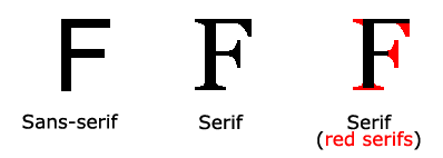
- Serif fonts have a small stroke at the edges of each letter. They create a sense of formality and elegance.
- Sans-serif fonts have clean lines (no small strokes attached). They create a modern and minimalistic look.
- Monospace fonts - here all the letters have the same fixed width. They create a mechanical look.
- Cursive fonts imitate human handwriting.
- Fantasy fonts are decorative/playful fonts.
All the different font names belong to one of the generic font families.
Difference Between Serif and Sans-serif Fonts
The CSS font-family Property
In CSS, we use the font-family property to specify the font of a text.
Example
Specify some different fonts for three paragraphs:
.p1 {
font-family: "Times New Roman", Times, serif;
}
.p2 {
font-family: Arial, Helvetica, sans-serif;
}
.p3 {
font-family: "Lucida Console", "Courier New", monospace;
}What are Web Safe Fonts?
Web safe fonts are fonts that are universally installed across all browsers and devices.
Fallback Fonts
However, there are no 100% completely web safe fonts. There is always a chance that a font is not found or is not installed properly.
Therefore, it is very important to always use fallback fonts.
This means that you should add a list of similar "backup fonts" in the font-family property. If the first font does not work, the browser will try the next one, and the next one, and so on. Always end the list with a generic font family name.
Example
Here, there are three font types: Tahoma, Verdana, and sans-serif. The second and third fonts are backups, in case the first one is not found.
p {
font-family: Tahoma, Verdana, sans-serif;
}Best Web Safe Fonts for HTML and CSS
The following list are the best web safe fonts for HTML and CSS:
- Arial (sans-serif)
- Verdana (sans-serif)
- Tahoma (sans-serif)
- Trebuchet MS (sans-serif)
- Times New Roman (serif)
- Georgia (serif)
- Garamond (serif)
- Courier New (monospace)
- Brush Script MT (cursive)
Note: Before you publish your website, always check how your fonts appear on different browsers and devices, and always use fallback fonts!
Arial (sans-serif)
Arial is the most widely used font for both online and printed media. Arial is also the default font in Google Docs.
Arial is one of the safest web fonts, and it is available on all major operating systems.
Example
Lorem ipsum dolor sit amet
Lorem ipsum dolor sit amet.
0 1 2 3 4 5 6 7 8 9
Verdana (sans-serif)
Verdana is a very popular font. Verdana is easily readable even for small font sizes.
Example
Lorem ipsum dolor sit amet
Lorem ipsum dolor sit amet.
0 1 2 3 4 5 6 7 8 9
Tahoma (sans-serif)
The Tahoma font has less space between the characters.
Example
Lorem ipsum dolor sit amet
Lorem ipsum dolor sit amet.
0 1 2 3 4 5 6 7 8 9
Trebuchet MS (sans-serif)
Trebuchet MS was designed by Microsoft in 1996. Use this font carefully. Not supported by all mobile operating systems.
Example
Lorem ipsum dolor sit amet
Lorem ipsum dolor sit amet.
0 1 2 3 4 5 6 7 8 9
Times New Roman (serif)
Times New Roman is one of the most recognizable fonts in the world. It looks professional and is used in many newspapers and "news" websites. It is also the primary font for Windows devices and applications.
Example
Lorem ipsum dolor sit amet
Lorem ipsum dolor sit amet.
0 1 2 3 4 5 6 7 8 9
Georgia (serif)
Georgia is an elegant serif font. It is very readable at different font sizes, so it is a good candidate for mobile-responsive design.
Example
Lorem ipsum dolor sit amet
Lorem ipsum dolor sit amet.
0 1 2 3 4 5 6 7 8 9
Garamond (serif)
Garamond is a classical font used for many printed books. It has a timeless look and good readability.
Example
Lorem ipsum dolor sit amet
Lorem ipsum dolor sit amet.
0 1 2 3 4 5 6 7 8 9
Courier New (monospace)
Courier New is the most widely used monospace serif font. Courier New is often used with coding displays, and many email providers use it as their default font. Courier New is also the standard font for movie screenplays.
Example
Lorem ipsum dolor sit amet
Lorem ipsum dolor sit amet.
0 1 2 3 4 5 6 7 8 9
Brush Script MT (cursive)
The Brush Script MT font was designed to mimic handwriting. It is elegant and sophisticated, but can be hard to read. Use it carefully.
Example
Lorem ipsum dolor sit amet
Lorem ipsum dolor sit amet.
0 1 2 3 4 5 6 7 8 9
Commonly Used Font Fallbacks
Below are some commonly used font fallbacks, organized by the 5 generic font families:
- Serif
- Sans-serif
- Monospace
- Cursive
- Fantasy
Font Style
The font-style property is mostly used to specify italic text.
This property has three values:
- normal - The text is shown normally
- italic - The text is shown in italics
- oblique - The text is "leaning" (oblique is very similar to italic, but less supported)
Example
p.normal {
font-style: normal;
}
p.italic {
font-style: italic;
}
p.oblique {
font-style: oblique;
}Font Weight
The font-weight property specifies the weight of a font:
Example
p.normal {
font-weight: normal;
}
p.thick {
font-weight: bold;
}Font Variant
The font-variant property specifies whether or not a text should be displayed in a small-caps font.
In a small-caps font, all lowercase letters are converted to uppercase letters. However, the converted uppercase letters appears in a smaller font size than the original uppercase letters in the text.
Example
p.normal {
font-variant: normal;
}
p.small {
font-variant: small-caps;
}Font Size
The font-size property sets the size of the text.
Being able to manage the text size is important in web design. However, you should not use font size adjustments to make paragraphs look like headings, or headings look like paragraphs.
Always use the proper HTML tags, like <h1> - <h6> for headings and <p> for paragraphs.
The font-size value can be an absolute, or relative size.
Absolute size:
- Sets the text to a specified size
- Does not allow a user to change the text size in all browsers (bad for accessibility reasons)
- Absolute size is useful when the physical size of the output is known
Relative size:
- Sets the size relative to surrounding elements
- Allows a user to change the text size in browsers
Note: If you do not specify a font size, the default size for normal text, like paragraphs, is 16px (16px=1em).
Set Font Size With Pixels
Setting the text size with pixels gives you full control over the text size:
Example
h1 {
font-size: 40px;
}
h2 {
font-size: 30px;
}
p {
font-size: 14px;
}Tip: If you use pixels, you can still use the zoom tool to resize the entire page.
Set Font Size With Em
To allow users to resize the text (in the browser menu), many developers use em instead of pixels.
1em is equal to the current font size. The default text size in browsers is 16px. So, the default size of 1em is 16px.
The size can be calculated from pixels to em using this formula: pixels/16=em
Example
h1 {
font-size: 2.5em; /* 40px/16=2.5em */
}
h2 {
font-size: 1.875em; /* 30px/16=1.875em */
}
p {
font-size: 0.875em; /* 14px/16=0.875em */
}In the example above, the text size in em is the same as the previous example in pixels. However, with the em size, it is possible to adjust the text size in all browsers.
Unfortunately, there is still a problem with older versions of Internet Explorer. The text becomes larger than it should when made larger, and smaller than it should when made smaller.
Use a Combination of Percent and Em
The solution that works in all browsers, is to set a default font-size in percent for the <body> element:
Example
body {
font-size: 100%;
}
h1 {
font-size: 2.5em;
}
h2 {
font-size: 1.875em;
}
p {
font-size: 0.875em;
}Our code now works great! It shows the same text size in all browsers, and allows all browsers to zoom or resize the text!
Responsive Font Size
The text size can be set with a vw unit, which means the "viewport width".
That way the text size will follow the size of the browser window:
Hello World
Resize the browser window to see how the font size scales.
Example
<h1 style="font-size:10vw">Hello World</h1>Google Fonts
If you do not want to use any of the standard fonts in HTML, you can use Google Fonts.
Google Fonts are free to use, and have more than 1000 fonts to choose from.
How To Use Google Fonts
Just add a special style sheet link in the <head> section and then refer to the font in the CSS.
Example
Here, we want to use a font named "Sofia" from Google Fonts:
<head>
<link rel="stylesheet" href="https://fonts.googleapis.com/css?family=Sofia">
<style>
body {
font-family: "Sofia", sans-serif;
}
</style>
</head>
Result:
Sofia Font
Lorem ipsum dolor sit amet.
123456790
Example
Here, we want to use a font named "Trirong" from Google Fonts:
<head>
<link rel="stylesheet" href="https://fonts.googleapis.com/css?family=Trirong">
<style>
body {
font-family: "Trirong", serif;
}
</style>
</head>
Result:
Trirong Font
Lorem ipsum dolor sit amet.
123456790
Example
Here, we want to use a font named "Audiowide" from Google Fonts:
<head>
<link rel="stylesheet" href="https://fonts.googleapis.com/css?family=Audiowide">
<style>
body {
font-family: "Audiowide", sans-serif;
}
</style>
</head>Result:
Audiowide Font
Lorem ipsum dolor sit amet.
123456790
Note: When specifying a font in CSS, always list at minimum one fallback font (to avoid unexpected behaviors). So, also here you should add a generic font family (like serif or sans-serif) to the end of the list.
For a list of all available Google Fonts, visit our How To - Google Fonts Tutorial.
Use Multiple Google Fonts
To use multiple Google fonts, just separate the font names with a pipe character (|), like this:
Example
Request multiple fonts:
<head>
<link rel="stylesheet" href="https://fonts.googleapis.com/css?family=Audiowide|Sofia|Trirong">
<style>
h1.a {font-family: "Audiowide", sans-serif;}
h1.b {font-family: "Sofia", sans-serif;}
h1.c {font-family: "Trirong", serif;}
</style>
</head>
Result:
Audiowide Font
Sofia Font
Trirong Font
Note: Requesting multiple fonts may slow down your web pages! So be careful about that.
Styling Google Fonts
Of course you can style Google Fonts as you like, with CSS!
Example
Style the "Sofia" font:
<head>
<link rel="stylesheet" href="https://fonts.googleapis.com/css?family=Sofia">
<style>
body {
font-family: "Sofia", sans-serif;
font-size: 30px;
text-shadow: 3px 3px 3px #ababab;
}
</style>
</head>
Result:
Sofia Font
Lorem ipsum dolor sit amet.
123456790
Enabling Font Effects
Google has also enabled different font effects that you can use.
First add effect=effectname to the Google API, then add a special class name to the element that is going to use the special effect. The class name always starts with font-effect- and ends with the effectname.
Example
Add the fire effect to the "Sofia" font:
<head>
<link rel="stylesheet" href="https://fonts.googleapis.com/css?family=Sofia&effect=fire">
<style>
body {
font-family: "Sofia", sans-serif;
font-size: 30px;
}
</style>
</head>
<body>
<h1 class="font-effect-fire">Sofia on Fire</h1>
</body>
Result:
Sofia on Fire
To request multiple font effects, just separate the effect names with a pipe character (|), like this:
Example
Add multiple effects to the "Sofia" font:
<head>
<link rel="stylesheet" href="https://fonts.googleapis.com/css?family=Sofia&effect=neon|outline|emboss|shadow-multiple">
<style>
body {
font-family: "Sofia", sans-serif;
font-size: 30px;
}
</style>
</head>
<body>
<h1 class="font-effect-neon">Neon Effect</h1>
<h1 class="font-effect-outline">Outline Effect</h1>
<h1 class="font-effect-emboss">Emboss Effect</h1>
<h1 class="font-effect-shadow-multiple">Multiple Shadow Effect</h1>
</body>
Result:
Neon Effect
Outline Effect
Emboss Effect
Multiple Shadow Effect
Font Pairing Rules
Here are some basic rules to create great font pairings:
1. Complement
It is always safe to find font pairings that complement one another.
A great font combination should harmonize, without being too similar or too different.
2. Use Font Superfamilies
A font superfamily is a set of fonts designed to work well together. So, using different fonts within the same superfamily is safe.
For example, the Lucida superfamily contains the following fonts: Lucida Sans, Lucida Serif, Lucida Typewriter Sans, Lucida Typewriter Serif and Lucida Math.
3. Contrast is King
Two fonts that are too similar will often conflict. However, contrasts, done the right way, brings out the best in each font.
Example: Combining serif with sans serif is a well known combination.
A strong superfamily includes both serif and sans serif variations of the same font (e.g. Lucida and Lucida Sans).
4. Choose Only One Boss
One font should be the boss. This establishes a hierarchy for the fonts on your page. This can be achieved by varying the size, weight and color.
Example
No doubt "Georgia" is the boss here:
body {
background-color: black;
font-family: Verdana, sans-serif;
font-size: 16px;
color: gray;
}
h1 {
font-family: Georgia, serif;
font-size: 60px;
color: white;
}Below, we have shown some popular font pairings that will suit many brands and contexts.
Georgia and Verdana
Georgia and Verdana is a classic combination. It also sticks to the web safe font standards:
Example
Use the "Georgia" font for headings, and "Verdana" for text:
Beautiful Norway
Norway has a total area of 385,252 square kilometers and a population of 5,438,657 (December 2020). Norway is bordered by Sweden, Finland and Russia to the north-east, and the Skagerrak to the south, with Denmark on the other side.
Norway has beautiful mountains, glaciers and stunning fjords. Oslo, the capital, is a city of green spaces and museums. Bergen, with colorful wooden houses, is the starting point for cruises to the dramatic Sognefjord. Norway is also known for fishing, hiking and skiing.
Helvetica and Garamond
Helvetica and Garamond is another classic combination that uses web safe fonts:
Example
Use the "Helvetica" font for headings, and "Garamond" for text:
Beautiful Norway
Norway has a total area of 385,252 square kilometers and a population of 5,438,657 (December 2020). Norway is bordered by Sweden, Finland and Russia to the north-east, and the Skagerrak to the south, with Denmark on the other side.
Norway has beautiful mountains, glaciers and stunning fjords. Oslo, the capital, is a city of green spaces and museums. Bergen, with colorful wooden houses, is the starting point for cruises to the dramatic Sognefjord. Norway is also known for fishing, hiking and skiing.
Popular Google Font Pairings
If you do not want to use standard fonts in HTML, you can use Google Fonts.
Google Fonts are free to use, and have more than 1000 fonts to choose from.
Below are some popular Google Web Font Pairings.
Merriweather and Open Sans
Example
Use the "Merriweather" font for headings, and "Open Sans" for text:
Beautiful Norway
Norway has a total area of 385,252 square kilometers and a population of 5,438,657 (December 2020). Norway is bordered by Sweden, Finland and Russia to the north-east, and the Skagerrak to the south, with Denmark on the other side.
Norway has beautiful mountains, glaciers and stunning fjords. Oslo, the capital, is a city of green spaces and museums. Bergen, with colorful wooden houses, is the starting point for cruises to the dramatic Sognefjord. Norway is also known for fishing, hiking and skiing.
Ubuntu and Lora
Example
Use the "Ubuntu" font for headings, and "Lora" for text:
Beautiful Norway
Norway has a total area of 385,252 square kilometers and a population of 5,438,657 (December 2020). Norway is bordered by Sweden, Finland and Russia to the north-east, and the Skagerrak to the south, with Denmark on the other side.
Norway has beautiful mountains, glaciers and stunning fjords. Oslo, the capital, is a city of green spaces and museums. Bergen, with colorful wooden houses, is the starting point for cruises to the dramatic Sognefjord. Norway is also known for fishing, hiking and skiing.
Abril Fatface and Poppins
Example
Use the "Abril Fatface" font for headings, and "Poppins" for text:
Beautiful Norway
Norway has a total area of 385,252 square kilometers and a population of 5,438,657 (December 2020). Norway is bordered by Sweden, Finland and Russia to the north-east, and the Skagerrak to the south, with Denmark on the other side.
Norway has beautiful mountains, glaciers and stunning fjords. Oslo, the capital, is a city of green spaces and museums. Bergen, with colorful wooden houses, is the starting point for cruises to the dramatic Sognefjord. Norway is also known for fishing, hiking and skiing.
Cinzel and Fauna One
Example
Use the "Cinzel" font for headings, and "Fauna One" for text:
Beautiful Norway
Norway has a total area of 385,252 square kilometers and a population of 5,438,657 (December 2020). Norway is bordered by Sweden, Finland and Russia to the north-east, and the Skagerrak to the south, with Denmark on the other side.
Norway has beautiful mountains, glaciers and stunning fjords. Oslo, the capital, is a city of green spaces and museums. Bergen, with colorful wooden houses, is the starting point for cruises to the dramatic Sognefjord. Norway is also known for fishing, hiking and skiing.
Fjalla One and Libre Baskerville
Example
Use the "Fjalla One" font for headings, and "Libre Baskerville" for text:
Beautiful Norway
Norway has a total area of 385,252 square kilometers and a population of 5,438,657 (December 2020). Norway is bordered by Sweden, Finland and Russia to the north-east, and the Skagerrak to the south, with Denmark on the other side.
Norway has beautiful mountains, glaciers and stunning fjords. Oslo, the capital, is a city of green spaces and museums. Bergen, with colorful wooden houses, is the starting point for cruises to the dramatic Sognefjord. Norway is also known for fishing, hiking and skiing.
Space Mono and Muli
Example
Use the "Space Mono" font for headings, and "Muli" for text:
Beautiful Norway
Norway has a total area of 385,252 square kilometers and a population of 5,438,657 (December 2020). Norway is bordered by Sweden, Finland and Russia to the north-east, and the Skagerrak to the south, with Denmark on the other side.
Norway has beautiful mountains, glaciers and stunning fjords. Oslo, the capital, is a city of green spaces and museums. Bergen, with colorful wooden houses, is the starting point for cruises to the dramatic Sognefjord. Norway is also known for fishing, hiking and skiing.
Spectral and Rubik
Example
Use the "Spectral" font for headings, and "Rubik" for text:
Beautiful Norway
Norway has a total area of 385,252 square kilometers and a population of 5,438,657 (December 2020). Norway is bordered by Sweden, Finland and Russia to the north-east, and the Skagerrak to the south, with Denmark on the other side.
Norway has beautiful mountains, glaciers and stunning fjords. Oslo, the capital, is a city of green spaces and museums. Bergen, with colorful wooden houses, is the starting point for cruises to the dramatic Sognefjord. Norway is also known for fishing, hiking and skiing.
Oswald and Noto Sans
Example
Use the "Oswald" font for headings, and "Noto Sans" for text:
Beautiful Norway
Norway has a total area of 385,252 square kilometers and a population of 5,438,657 (December 2020). Norway is bordered by Sweden, Finland and Russia to the north-east, and the Skagerrak to the south, with Denmark on the other side.
Norway has beautiful mountains, glaciers and stunning fjords. Oslo, the capital, is a city of green spaces and museums. Bergen, with colorful wooden houses, is the starting point for cruises to the dramatic Sognefjord. Norway is also known for fishing, hiking and skiing.
The CSS Font Property
To shorten the code, it is also possible to specify all the individual font properties in one property.
The font property is a shorthand property for:
font-stylefont-variantfont-weightfont-size/line-heightfont-family
Note: The font-size and font-family values are required. If one of the other values is missing, their default value are used.
Example
Use font to set several font properties in one declaration:
p.a {
font: 20px Arial, sans-serif;
}
p.b {
font: italic small-caps bold 12px/30px Georgia, serif;
}Styling Links
Links can be styled with any CSS property (e.g. color, font-family, background, etc.).
Example
a {
color: hotpink;
}In addition, links can be styled differently depending on what state they are in.
The four links states are:
a:link- a normal, unvisited linka:visited- a link the user has visiteda:hover- a link when the user mouses over ita:active- a link the moment it is clicked
Example
/* unvisited link */
a:link {
color: red;
}
/* visited link */
a:visited {
color: green;
}
/* mouse over link */
a:hover {
color: hotpink;
}
/* selected link */
a:active {
color: blue;
}When setting the style for several link states, there are some order rules:
- a:hover MUST come after a:link and a:visited
- a:active MUST come after a:hover
Text Decoration
The text-decoration property is mostly used to remove underlines from links:
Example
a:link {
text-decoration: none;
}
a:visited {
text-decoration: none;
}
a:hover {
text-decoration: underline;
}
a:active {
text-decoration: underline;
}Background Color
The background-color property can be used to specify a background color for links:
Example
a:link {
background-color: yellow;
}
a:visited {
background-color: cyan;
}
a:hover {
background-color: lightgreen;
}
a:active {
background-color: hotpink;
} Link Buttons
This example demonstrates a more advanced example where we combine several CSS properties to display links as boxes/buttons:
Example
a:link, a:visited {
background-color: #f44336;
color: white;
padding: 14px 25px;
text-align: center;
text-decoration: none;
display: inline-block;
}
a:hover, a:active {
background-color: red;
}More Examples
Example
This example demonstrates how to add other styles to hyperlinks:
a.one:link {color: #ff0000;}
a.one:visited {color: #0000ff;}
a.one:hover {color: #ffcc00;}
a.two:link {color: #ff0000;}
a.two:visited {color: #0000ff;}
a.two:hover {font-size: 150%;}
a.three:link {color: #ff0000;}
a.three:visited {color: #0000ff;}
a.three:hover {background: #66ff66;}
a.four:link {color: #ff0000;}
a.four:visited {color: #0000ff;}
a.four:hover {font-family: monospace;}
a.five:link {color: #ff0000; text-decoration: none;}
a.five:visited {color: #0000ff; text-decoration: none;}
a.five:hover {text-decoration: underline;}Example
Another example of how to create link boxes/buttons:
a:link, a:visited {
background-color: white;
color: black;
border: 2px solid green;
padding: 10px 20px;
text-align: center;
text-decoration: none;
display: inline-block;
}
a:hover, a:active {
background-color: green;
color: white;
}Example
This example demonstrates the different types of cursors (can be useful for links):
<span style="cursor: auto">auto</span><br>
<span style="cursor: crosshair">crosshair</span><br>
<span style="cursor: default">default</span><br>
<span style="cursor: e-resize">e-resize</span><br>
<span style="cursor: help">help</span><br>
<span style="cursor: move">move</span><br>
<span style="cursor: n-resize">n-resize</span><br>
<span style="cursor: ne-resize">ne-resize</span><br>
<span style="cursor: nw-resize">nw-resize</span><br>
<span style="cursor: pointer">pointer</span><br>
<span style="cursor: progress">progress</span><br>
<span style="cursor: s-resize">s-resize</span><br>
<span style="cursor: se-resize">se-resize</span><br>
<span style="cursor: sw-resize">sw-resize</span><br>
<span style="cursor: text">text</span><br>
<span style="cursor: w-resize">w-resize</span><br>
<span style="cursor: wait">wait</span>Unordered Lists:
- Coffee
- Tea
- Coca Cola
- Coffee
- Tea
- Coca Cola
Ordered Lists:
- Coffee
- Tea
- Coca Cola
- Coffee
- Tea
- Coca Cola
HTML Lists and CSS List Properties
In HTML, there are two main types of lists:
- unordered lists (<ul>) - the list items are marked with bullets
- ordered lists (<ol>) - the list items are marked with numbers or letters
The CSS list properties allow you to:
- Set different list item markers for ordered lists
- Set different list item markers for unordered lists
- Set an image as the list item marker
- Add background colors to lists and list items
Different List Item Markers
The list-style-type property specifies the type of list item marker.
The following example shows some of the available list item markers:
Example
ul.a {
list-style-type: circle;
}
ul.b {
list-style-type: square;
}
ol.c {
list-style-type: upper-roman;
}
ol.d {
list-style-type: lower-alpha;
}Note: Some of the values are for unordered lists, and some for ordered lists.
An Image as The List Item Marker
The list-style-image property specifies an image as the list item marker:
Example
ul {
list-style-image: url('sqpurple.gif');
}Position The List Item Markers
The list-style-position property specifies the position of the list-item markers (bullet points).
"list-style-position: outside;" means that the bullet points will be outside the list item. The start of each line of a list item will be aligned vertically. This is default:
- Coffee - A brewed drink prepared from roasted coffee beans...
- Tea
- Coca-cola
"list-style-position: inside;" means that the bullet points will be inside the list item. As it is part of the list item, it will be part of the text and push the text at the start:
- Coffee - A brewed drink prepared from roasted coffee beans...
- Tea
- Coca-cola
Example
ul.a {
list-style-position: outside;
}
ul.b {
list-style-position: inside;
}Remove Default Settings
The list-style-type:none property can also be used to remove the markers/bullets. Note that the list also has default margin and padding. To remove this, add margin:0 and padding:0 to <ul> or <ol>:
Example
ul {
list-style-type: none;
margin: 0;
padding: 0;
}List - Shorthand property
The list-style property is a shorthand property. It is used to set all the list properties in one declaration:
Example
ul {
list-style: square inside url("sqpurple.gif");
}When using the shorthand property, the order of the property values are:
list-style-type(if a list-style-image is specified, the value of this property will be displayed if the image for some reason cannot be displayed)list-style-position(specifies whether the list-item markers should appear inside or outside the content flow)list-style-image(specifies an image as the list item marker)
If one of the property values above is missing, the default value for the missing property will be inserted, if any.
Styling List With Colors
We can also style lists with colors, to make them look a little more interesting.
Anything added to the <ol> or <ul> tag, affects the entire list, while properties added to the <li> tag will affect the individual list items:
Example
ol {
background: #ff9999;
padding: 20px;
}
ul {
background: #3399ff;
padding: 20px;
}
ol li {
background: #ffe5e5;
color: darkred;
padding: 5px;
margin-left: 35px;
}
ul li {
background: #cce5ff;
color: darkblue;
margin: 5px;
}Result:
- Coffee
- Tea
- Coca Cola
- Coffee
- Tea
- Coca Cola
CSS Tables
Table Borders
To specify table borders in CSS, use the border property.
The example below specifies a solid border for <table>, <th>, and <td> elements:
| Firstname | Lastname |
|---|---|
| Peter | Griffin |
| Lois | Griffin |
Example
table, th, td {
border: 1px solid;
}Full-Width Table
The table above might seem small in some cases. If you need a table that should span the entire screen (full-width), add width: 100% to the <table> element:
| Firstname | Lastname |
|---|---|
| Peter | Griffin |
| Lois | Griffin |
Example
table {
width: 100%;
}Collapse Table Borders
The border-collapse property sets whether the table borders should be collapsed into a single border:
| Firstname | Lastname |
|---|---|
| Peter | Griffin |
| Lois | Griffin |
Example
table {
border-collapse: collapse;
}If you only want a border around the table, only specify the border property for <table>:
| Firstname | Lastname |
|---|---|
| Peter | Griffin |
| Lois | Griffin |
Example
table {
border: 1px solid;
}CSS Table Size
Table Width and Height
The width and height of a table are defined by the width and height properties.
The example below sets the width of the table to 100%, and the height of the <th> elements to 70px:
| Firstname | Lastname | Savings |
|---|---|---|
| Peter | Griffin | $100 |
| Lois | Griffin | $150 |
| Joe | Swanson | $300 |
Example
table {
width: 100%;
}
th {
height: 70px;
}To create a table that should only span half the page, use width: 50%:
| Firstname | Lastname | Savings |
|---|---|---|
| Peter | Griffin | $100 |
| Lois | Griffin | $150 |
| Joe | Swanson | $300 |
Example
table {
width: 50%;
}Horizontal Alignment
The text-align property sets the horizontal alignment (like left, right, or center) of the content in <th> or <td>.
By default, the content of <th> elements are center-aligned and the content of <td> elements are left-aligned.
To center-align the content of <td> elements as well, use text-align: center:
| Firstname | Lastname | Savings |
|---|---|---|
| Peter | Griffin | $100 |
| Lois | Griffin | $150 |
| Joe | Swanson | $300 |
Example
td {
text-align: center;
}To left-align the content, force the alignment of <th> elements to be left-aligned, with the text-align: left property:
| Firstname | Lastname | Savings |
|---|---|---|
| Peter | Griffin | $100 |
| Lois | Griffin | $150 |
| Joe | Swanson | $300 |
Example
th {
text-align: left;
}Vertical Alignment
The vertical-align property sets the vertical alignment (like top, bottom, or middle) of the content in <th> or <td>.
By default, the vertical alignment of the content in a table is middle (for both <th> and <td> elements).
The following example sets the vertical text alignment to bottom for <td> elements:
| Firstname | Lastname | Savings |
|---|---|---|
| Peter | Griffin | $100 |
| Lois | Griffin | $150 |
| Joe | Swanson | $300 |
Example
td {
height: 50px;
vertical-align: bottom;
}Table Padding
To control the space between the border and the content in a table, use the padding property on <td> and <th> elements:
| First Name | Last Name | Savings |
|---|---|---|
| Peter | Griffin | $100 |
| Lois | Griffin | $150 |
| Joe | Swanson | $300 |
Example
th, td {
padding: 15px;
text-align: left;
}Horizontal Dividers
| First Name | Last Name | Savings |
|---|---|---|
| Peter | Griffin | $100 |
| Lois | Griffin | $150 |
| Joe | Swanson | $300 |
Add the border-bottom property to <th> and <td> for horizontal dividers:
Example
th, td {
border-bottom: 1px solid #ddd;
}Hoverable Table
Use the :hover selector on <tr> to highlight table rows on mouse over:
| First Name | Last Name | Savings |
|---|---|---|
| Peter | Griffin | $100 |
| Lois | Griffin | $150 |
| Joe | Swanson | $300 |
Example
tr:hover {background-color: coral;}Striped Tables
| First Name | Last Name | Savings |
|---|---|---|
| Peter | Griffin | $100 |
| Lois | Griffin | $150 |
| Joe | Swanson | $300 |
For zebra-striped tables, use the nth-child() selector and add a background-color to all even (or odd) table rows:
Example
tr:nth-child(even) {background-color: #f2f2f2;}Table Color
The example below specifies the background color and text color of <th> elements:
| First Name | Last Name | Savings |
|---|---|---|
| Peter | Griffin | $100 |
| Lois | Griffin | $150 |
| Joe | Swanson | $300 |
Example
th {
background-color: #04AA6D;
color: white;
}Responsive Table
A responsive table will display a horizontal scroll bar if the screen is too small to display the full content:
| First Name | Last Name | Points | Points | Points | Points | Points | Points | Points | Points | Points | Points | Points | Points |
|---|---|---|---|---|---|---|---|---|---|---|---|---|---|
| Jill | Smith | 50 | 50 | 50 | 50 | 50 | 50 | 50 | 50 | 50 | 50 | 50 | 50 |
| Eve | Jackson | 94 | 94 | 94 | 94 | 94 | 94 | 94 | 94 | 94 | 94 | 94 | 94 |
| Adam | Johnson | 67 | 67 | 67 | 67 | 67 | 67 | 67 | 67 | 67 | 67 | 67 | 67 |
Add a container element (like <div>) with overflow-x:auto around the <table> element to make it responsive
Example
<div style="overflow-x:auto;">
<table>
... table content ...
</table>
</div>CSS Layout - The display Property
display property is the most important CSS property for controlling layout.The display Property
The display property specifies if/how an element is displayed.
Every HTML element has a default display value depending on what type of element it is. The default display value for most elements is block or inline.
Block-level Elements
A block-level element always starts on a new line and takes up the full width available (stretches out to the left and right as far as it can).
Examples of block-level elements:
- <div>
- <h1> - <h6>
- <p>
- <form>
- <header>
- <footer>
- <section>
Inline Elements
An inline element does not start on a new line and only takes up as much width as necessary.
This is an inline <span> element inside a paragraph.
Examples of inline elements:
- <span>
- <a>
- <img>
Display: none;
display: none; is commonly used with JavaScript to hide and show elements without deleting and recreating them. Take a look at our last example on this page if you want to know how this can be achieved.
The <script> element uses display: none; as default.
Override The Default Display Value
As mentioned, every element has a default display value. However, you can override this.
Changing an inline element to a block element, or vice versa, can be useful for making the page look a specific way, and still follow the web standards.
A common example is making inline <li> elements for horizontal menus:
Example
li {
display: inline;
}The following example displays <span> elements as block elements:
Example
span {
display: block;
}The following example displays <a> elements as block elements:
Example
a {
display: block;
}Hiding an element can be done by setting the display property to none. The element will be hidden, and the page will be displayed as if the element is not there:
Example
h1.hidden {
display: none;
}visibility:hidden; also hides an element.
However, the element will still take up the same space as before. The element will be hidden, but still affect the layout:
Example
h1.hidden {
visibility: hidden;
}CSS Layout - width and max-width
Using width, max-width and margin: auto;
As mentioned in the previous chapter; a block-level element always takes up the full width available (stretches out to the left and right as far as it can).
Setting the width of a block-level element will prevent it from stretching out to the edges of its container. Then, you can set the margins to auto, to horizontally center the element within its container. The element will take up the specified width, and the remaining space will be split equally between the two margins:
Using max-width instead, in this situation, will improve the browser's handling of small windows. This is important when making a site usable on small devices:
Tip: Resize the browser window to less than 500px wide, to see the difference between the two divs!
Here is an example of the two divs above:
Example
div.ex1 {
width: 500px;
margin: auto;
border: 3px solid #73AD21;
}
div.ex2 {
max-width: 500px;
margin: auto;
border: 3px solid #73AD21;
}CSS Layout - The position Property
position property specifies the type of positioning method used for an element (static, relative, fixed, absolute or sticky).The position Property
The position property specifies the type of positioning method used for an element.
There are five different position values:
staticrelativefixedabsolutesticky
Elements are then positioned using the top, bottom, left, and right properties. However, these properties will not work unless the position property is set first. They also work differently depending on the position value.
position: static;
HTML elements are positioned static by default.
Static positioned elements are not affected by the top, bottom, left, and right properties.
An element with position: static; is not positioned in any special way; it is always positioned according to the normal flow of the page:
Here is the CSS that is used:
Example
div.static {
position: static;
border: 3px solid #73AD21;
}position: relative;
An element with position: relative; is positioned relative to its normal position.
Setting the top, right, bottom, and left properties of a relatively-positioned element will cause it to be adjusted away from its normal position. Other content will not be adjusted to fit into any gap left by the element.
Here is the CSS that is used:
Example
div.relative {
position: relative;
left: 30px;
border: 3px solid #73AD21;
}The position property specifies the type of positioning method used for an element (static, relative, fixed, absolute or sticky).
The position Property
The position property specifies the type of positioning method used for an element.
There are five different position values:
staticrelativefixedabsolutesticky
Elements are then positioned using the top, bottom, left, and right properties. However, these properties will not work unless the position property is set first. They also work differently depending on the position value.
position: static;
HTML elements are positioned static by default.
Static positioned elements are not affected by the top, bottom, left, and right properties.
An element with position: static; is not positioned in any special way; it is always positioned according to the normal flow of the page:
Here is the CSS that is used:
Example
div.static {
position: static;
border: 3px solid #73AD21;
}position: relative;
An element with position: relative; is positioned relative to its normal position.
Setting the top, right, bottom, and left properties of a relatively-positioned element will cause it to be adjusted away from its normal position. Other content will not be adjusted to fit into any gap left by the element.
Here is the CSS that is used:
Example
div.relative {
position: relative;
left: 30px;
border: 3px solid #73AD21;
}CSS Layout - The z-index Property
The z-index property specifies the stack order of an element.
The z-index Property
When elements are positioned, they can overlap other elements.
The z-index property specifies the stack order of an element (which element should be placed in front of, or behind, the others).
An element can have a positive or negative stack order:
This is a heading
Because the image has a z-index of -1, it will be placed behind the text.
Example
img {
position: absolute;
left: 0px;
top: 0px;
z-index: -1;
}Note: z-index only works on positioned elements (position: absolute, position: relative, position: fixed, or position: sticky) and flex items (elements that are direct children of display: flex elements).
Another z-index Example
Example
Here we see that an element with greater stack order is always above an element with a lower stack order:
<html>
<head>
<style>
.container {
position: relative;
}
.black-box {
position: relative;
z-index: 1;
border: 2px solid black;
height: 100px;
margin: 30px;
}
.gray-box {
position: absolute;
z-index: 3;
background: lightgray;
height: 60px;
width: 70%;
left: 50px;
top: 50px;
}
.green-box {
position: absolute;
z-index: 2;
background: lightgreen;
width: 35%;
left: 270px;
top: -15px;
height: 100px;
}
</style>
</head>
<body>
<div class="container">
<div class="black-box">Black box</div>
<div class="gray-box">Gray box</div>
<div class="green-box">Green box</div>
</div>
</body>
</html>Without z-index
If two positioned elements overlap each other without a z-index specified, the element defined last in the HTML code will be shown on top.
Example
Same example as above, but here with no z-index specified:
<html>
<head>
<style>
.container {
position: relative;
}
.black-box {
position: relative;
border: 2px solid black;
height: 100px;
margin: 30px;
}
.gray-box {
position: absolute;
background: lightgray;
height: 60px;
width: 70%;
left: 50px;
top: 50px;
}
.green-box {
position: absolute;
background: lightgreen;
width: 35%;
left: 270px;
top: -15px;
height: 100px;
}
</style>
</head>
<body>
<div class="container">
<div class="black-box">Black box</div>
<div class="gray-box">Gray box</div>
<div class="green-box">Green box</div>
</div>
</body>
</html>CSS Layout - Overflow
overflow property controls what happens to content that is too big to fit into an area.CSS Overflow
The overflow property specifies whether to clip the content or to add scrollbars when the content of an element is too big to fit in the specified area.
The overflow property has the following values:
visible- Default. The overflow is not clipped. The content renders outside the element's boxhidden- The overflow is clipped, and the rest of the content will be invisiblescroll- The overflow is clipped, and a scrollbar is added to see the rest of the contentauto- Similar toscroll, but it adds scrollbars only when necessary
Note: The overflow property only works for block elements with a specified height.
Note: In OS X Lion (on Mac), scrollbars are hidden by default and only shown when being used (even though "overflow:scroll" is set).
overflow: visible
By default, the overflow is visible, meaning that it is not clipped and it renders outside the element's box:
Example
div {
width: 200px;
height: 65px;
background-color: coral;
overflow: visible;
}overflow: hidden
With the hidden value, the overflow is clipped, and the rest of the content is hidden:
Example
div {
overflow: hidden;
}overflow: scroll
Setting the value to scroll, the overflow is clipped and a scrollbar is added to scroll inside the box. Note that this will add a scrollbar both horizontally and vertically (even if you do not need it):
Example
div {
overflow: scroll;
}overflow: auto
The auto value is similar to scroll, but it adds scrollbars only when necessary:
Example
div {
overflow: auto;
}overflow-x and overflow-y
The overflow-x and overflow-y properties specifies whether to change the overflow of content just horizontally or vertically (or both):
overflow-x specifies what to do with the left/right edges of the content.overflow-y specifies what to do with the top/bottom edges of the content.
Example
div {
overflow-x: hidden; /* Hide horizontal scrollbar */
overflow-y: scroll; /* Add vertical scrollbar */
}CSS Layout - float and clear
float property specifies how an element should float.The CSS clear property specifies what elements can float beside the cleared element and on which side.
The float Property
The float property is used for positioning and formatting content e.g. let an image float left to the text in a container.
The float property can have one of the following values:
left- The element floats to the left of its containerright- The element floats to the right of its containernone- The element does not float (will be displayed just where it occurs in the text). This is defaultinherit- The element inherits the float value of its parent
In its simplest use, the float property can be used to wrap text around images.
Example - float: right;
The following example specifies that an image should float to the right in a text:
 Lorem ipsum dolor sit amet, consectetur adipiscing elit. Phasellus imperdiet, nulla et dictum interdum, nisi lorem egestas odio, vitae scelerisque enim ligula venenatis dolor. Maecenas nisl est, ultrices nec congue eget, auctor vitae massa.
Example
img {
float: right;
}Example - float: left;
The following example specifies that an image should float to the left in a text:
Lorem ipsum dolor sit amet, consectetur adipiscing elit. Phasellus imperdiet, nulla et dictum interdum, nisi lorem egestas odio, vitae scelerisque enim ligula venenatis dolor. Maecenas nisl est, ultrices nec congue eget, auctor vitae massa.
Example
img {
float: left;
}Example - No float
In the following example the image will be displayed just where it occurs in the text (float: none;):
Lorem ipsum dolor sit amet, consectetur adipiscing elit. Phasellus imperdiet, nulla et dictum interdum, nisi lorem egestas odio, vitae scelerisque enim ligula venenatis dolor. Maecenas nisl est, ultrices nec congue eget, auctor vitae massa.
Example
img {
float: none;
}Example - Float Next To Each Other
Normally div elements will be displayed on top of each other. However, if we use float: left we can let elements float next to each other:
Example
div {
float: left;
padding: 15px;
}
.div1 {
background: red;
}
.div2 {
background: yellow;
}
.div3 {
background: green;
}CSS Layout - clear and clearfix
The clear Property
When we use the float property, and we want the next element below (not on right or left), we will have to use the clear property.
The clear property specifies what should happen with the element that is next to a floating element.
The clear property can have one of the following values:
none- The element is not pushed below left or right floated elements. This is defaultleft- The element is pushed below left floated elementsright- The element is pushed below right floated elementsboth- The element is pushed below both left and right floated elementsinherit- The element inherits the clear value from its parent
When clearing floats, you should match the clear to the float: If an element is floated to the left, then you should clear to the left. Your floated element will continue to float, but the cleared element will appear below it on the web page.
Example
This example clears the float to the left. Here, it means that the <div2> element is pushed below the left floated <div1> element:
div1 {
float: left;
}
div2 {
clear: left;
}The clearfix Hack
If a floated element is taller than the containing element, it will "overflow" outside of its container. We can then add a clearfix hack to solve this problem:
Without Clearfix
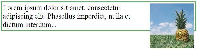
With Clearfix
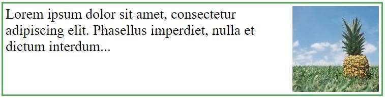
Example
.clearfix {
overflow: auto;
}The overflow: auto clearfix works well as long as you are able to keep control of your margins and padding (else you might see scrollbars). The new, modern clearfix hack however, is safer to use, and the following code is used for most webpages:
Example
.clearfix::after {
content: "";
clear: both;
display: table;
}CSS Layout - display: inline-block
The display: inline-block Value
Compared to display: inline, the major difference is that display: inline-block allows to set a width and height on the element.
Also, with display: inline-block, the top and bottom margins/paddings are respected, but with display: inline they are not.
Compared to display: block, the major difference is that display: inline-block does not add a line-break after the element, so the element can sit next to other elements.
The following example shows the different behavior of display: inline, display: inline-block and display: block:
Example
span.a {
display: inline; /* the default for span */
width: 100px;
height: 100px;
padding: 5px;
border: 1px solid blue;
background-color: yellow;
}
span.b {
display: inline-block;
width: 100px;
height: 100px;
padding: 5px;
border: 1px solid blue;
background-color: yellow;
}
span.c {
display: block;
width: 100px;
height: 100px;
padding: 5px;
border: 1px solid blue;
background-color: yellow;
}Using inline-block to Create Navigation Links
One common use for display: inline-block is to display list items horizontally instead of vertically. The following example creates horizontal navigation links:
Example
.nav {
background-color: yellow;
list-style-type: none;
text-align: center;
padding: 0;
margin: 0;
}
.nav li {
display: inline-block;
font-size: 20px;
padding: 20px;
}CSS Layout - Horizontal & Vertical Align
Center Align Elements
To horizontally center a block element (like <div>), use margin: auto;
Setting the width of the element will prevent it from stretching out to the edges of its container.
The element will then take up the specified width, and the remaining space will be split equally between the two margins:
This div element is centered.
Example
.center {
margin: auto;
width: 50%;
border: 3px solid green;
padding: 10px;
}Note: Center aligning has no effect if the width property is not set (or set to 100%).
Center Align Text
To just center the text inside an element, use text-align: center;
This text is centered.
Example
.center {
text-align: center;
border: 3px solid green;
}Tip: For more examples on how to align text, see the CSS Text chapter.
Center an Image
To center an image, set left and right margin to auto and make it into a block element:

Example
img {
display: block;
margin-left: auto;
margin-right: auto;
width: 40%;
}Left and Right Align - Using position
One method for aligning elements is to use position: absolute;:
In my younger and more vulnerable years my father gave me some advice that I've been turning over in my mind ever since.
Example
.right {
position: absolute;
right: 0px;
width: 300px;
border: 3px solid #73AD21;
padding: 10px;
}Note: Absolute positioned elements are removed from the normal flow, and can overlap elements.
Left and Right Align - Using float
Another method for aligning elements is to use the float property:
Example
.right {
float: right;
width: 300px;
border: 3px solid #73AD21;
padding: 10px;
}The clearfix Hack
Note: If an element is taller than the element containing it, and it is floated, it will overflow outside of its container. You can use the "clearfix hack" to fix this (see example below).
Without Clearfix
With Clearfix
Then we can add the clearfix hack to the containing element to fix this problem:
Example
.clearfix::after {
content: "";
clear: both;
display: table;
}Center Vertically - Using padding
There are many ways to center an element vertically in CSS. A simple solution is to use top and bottom padding:
I am vertically centered.
Example
.center {
padding: 70px 0;
border: 3px solid green;
}To center both vertically and horizontally, use padding and text-align: center:
I am vertically and horizontally centered.
Example
.center {
padding: 70px 0;
border: 3px solid green;
text-align: center;
}Center Vertically - Using line-height
Another trick is to use the line-height property with a value that is equal to the height property:
I am vertically and horizontally centered.
Example
.center {
line-height: 200px;
height: 200px;
border: 3px solid green;
text-align: center;
}
/* If the text has multiple lines, add the following: */
.center p {
line-height: 1.5;
display: inline-block;
vertical-align: middle;
}Center Vertically - Using position & transform
If padding and line-height are not options, another solution is to use positioning and the transform property:
I am vertically and horizontally centered.
Example
.center {
height: 200px;
position: relative;
border: 3px solid green;
}
.center p {
margin: 0;
position: absolute;
top: 50%;
left: 50%;
transform: translate(-50%, -50%);
}Tip: You will learn more about the transform property in our 2D Transforms Chapter.
Center Vertically - Using Flexbox
You can also use flexbox to center things. Just note that flexbox is not supported in IE10 and earlier versions:
Example
.center {
display: flex;
justify-content: center;
align-items: center;
height: 200px;
border: 3px solid green;
}CSS Combinators
There are four different combinators in CSS:
- descendant selector (space)
- child selector (>)
- adjacent sibling selector (+)
- general sibling selector (~)
Descendant Selector
The descendant selector matches all elements that are descendants of a specified element.
The following example selects all <p> elements inside <div> elements:
Example
div p {
background-color: yellow;
}Child Selector (>)
The child selector selects all elements that are the children of a specified element.
The following example selects all <p> elements that are children of a <div> element:
Example
div > p {
background-color: yellow;
}Adjacent Sibling Selector (+)
The adjacent sibling selector is used to select an element that is directly after another specific element.
Sibling elements must have the same parent element, and "adjacent" means "immediately following".
The following example selects the first <p> element that are placed immediately after <div> elements:
Example
div + p {
background-color: yellow;
}General Sibling Selector (~)
The general sibling selector selects all elements that are next siblings of a specified element.
The following example selects all <p> elements that are next siblings of <div> elements:
Example
div ~ p {
background-color: yellow;
}CSS Pseudo-classes
What are Pseudo-classes?
A pseudo-class is used to define a special state of an element.
For example, it can be used to:
- Style an element when a user mouses over it
- Style visited and unvisited links differently
- Style an element when it gets focus
Syntax
The syntax of pseudo-classes:
selector:pseudo-class {
property: value;
}Anchor Pseudo-classes
Links can be displayed in different ways:
Example
/* unvisited link */
a:link {
color: #FF0000;
}
/* visited link */
a:visited {
color: #00FF00;
}
/* mouse over link */
a:hover {
color: #FF00FF;
}
/* selected link */
a:active {
color: #0000FF;
}Note: a:hover MUST come after a:link and a:visited in the CSS definition in order to be effective! a:active MUST come after a:hover in the CSS definition in order to be effective! Pseudo-class names are not case-sensitive.
Pseudo-classes and HTML Classes
Pseudo-classes can be combined with HTML classes:
When you hover over the link in the example, it will change color:
Example
a.highlight:hover {
color: #ff0000;
}Hover on <div>
An example of using the :hover pseudo-class on a <div> element:
Example
div:hover {
background-color: blue;
}Simple Tooltip Hover
Hover over a <div> element to show a <p> element (like a tooltip):
Example
p {
display: none;
background-color: yellow;
padding: 20px;
}
div:hover p {
display: block;
}CSS - The :first-child Pseudo-class
The :first-child pseudo-class matches a specified element that is the first child of another element.
Match the first <p> element
In the following example, the selector matches any <p> element that is the first child of any element:
Example
p:first-child {
color: blue;
}Match the first <i> element in all <p> elements
In the following example, the selector matches the first <i> element in all <p> elements:
Example
p i:first-child {
color: blue;
}Match all <i> elements in all first child <p> elements
In the following example, the selector matches all <i> elements in <p> elements that are the first child of another element:
Example
p:first-child i {
color: blue;
}CSS - The :lang Pseudo-class
The :lang pseudo-class allows you to define special rules for different languages.
In the example below, :lang defines the quotation marks for <q> elements with lang="no":
Example
<html>
<head>
<style>
q:lang(no) {
quotes: "~" "~";
}
</style>
</head>
<body>
<p>Some text <q lang="no">A quote in a paragraph</q> Some text.</p>
</body>
</html>CSS Pseudo-elements
What are Pseudo-Elements?
A CSS pseudo-element is used to style specified parts of an element.
For example, it can be used to:
- Style the first letter, or line, of an element
- Insert content before, or after, the content of an element
Syntax
The syntax of pseudo-elements:
selector::pseudo-element {
property: value;
}The ::first-line Pseudo-element
The ::first-line pseudo-element is used to add a special style to the first line of a text.
The following example formats the first line of the text in all <p> elements:
Example
p::first-line {
color: #ff0000;
font-variant: small-caps;
}Note: The ::first-line pseudo-element can only be applied to block-level elements.
The following properties apply to the ::first-line pseudo-element:
- font properties
- color properties
- background properties
- word-spacing
- letter-spacing
- text-decoration
- vertical-align
- text-transform
- line-height
- clear
Notice the double colon notation - ::first-line versus :first-line
The double colon replaced the single-colon notation for pseudo-elements in CSS3. This was an attempt from W3C to distinguish between pseudo-classes and pseudo-elements.
The single-colon syntax was used for both pseudo-classes and pseudo-elements in CSS2 and CSS1.
For backward compatibility, the single-colon syntax is acceptable for CSS2 and CSS1 pseudo-elements.
The ::first-letter Pseudo-element
The ::first-letter pseudo-element is used to add a special style to the first letter of a text.
The following example formats the first letter of the text in all <p> elements:
Example
p::first-letter {
color: #ff0000;
font-size: xx-large;
}Note: The ::first-letter pseudo-element can only be applied to block-level elements.
The following properties apply to the ::first-letter pseudo- element:
- font properties
- color properties
- background properties
- margin properties
- padding properties
- border properties
- text-decoration
- vertical-align (only if "float" is "none")
- text-transform
- line-height
- float
- clear
Pseudo-elements and HTML Classes
Pseudo-elements can be combined with HTML classes:
Example
p.intro::first-letter {
color: #ff0000;
font-size: 200%;
}The example above will display the first letter of paragraphs with class="intro", in red and in a larger size.
Multiple Pseudo-elements
Several pseudo-elements can also be combined.
In the following example, the first letter of a paragraph will be red, in an xx-large font size. The rest of the first line will be blue, and in small-caps. The rest of the paragraph will be the default font size and color:
Example
p::first-letter {
color: #ff0000;
font-size: xx-large;
}
p::first-line {
color: #0000ff;
font-variant: small-caps;
}CSS - The ::before Pseudo-element
The ::before pseudo-element can be used to insert some content before the content of an element.
The following example inserts an image before the content of each <h1> element:
Example
h1::before {
content: url(smiley.gif);
}CSS - The ::after Pseudo-element
The ::after pseudo-element can be used to insert some content after the content of an element.
The following example inserts an image after the content of each <h1> element:
Example
h1::after {
content: url(smiley.gif);
}CSS - The ::marker Pseudo-element
The ::marker pseudo-element selects the markers of list items.
The following example styles the markers of list items:
Example
::marker {
color: red;
font-size: 23px;
}CSS - The ::selection Pseudo-element
The ::selection pseudo-element matches the portion of an element that is selected by a user.
The following CSS properties can be applied to ::selection: color, background, cursor, and outline.
The following example makes the selected text red on a yellow background:
Example
::selection {
color: red;
background: yellow;
}CSS Opacity / Transparency
opacity property specifies the opacity/transparency of an element.Transparent Image
The opacity property can take a value from 0.0 - 1.0. The lower the value, the more transparent:
opacity 0.2
opacity 0.5
opacity 1
(default)
Example
img {
opacity: 0.5;
}Transparent Hover Effect
The opacity property is often used together with the :hover selector to change the opacity on mouse-over:


Example
img {
opacity: 0.5;
}
img:hover {
opacity: 1.0;
}Example explained
The first CSS block is similar to the code in Example 1. In addition, we have added what should happen when a user hovers over one of the images. In this case we want the image to NOT be transparent when the user hovers over it. The CSS for this is opacity:1;.
When the mouse pointer moves away from the image, the image will be transparent again.
An example of reversed hover effect:
Example
img:hover {
opacity: 0.5;
}Transparent Box
When using the opacity property to add transparency to the background of an element, all of its child elements inherit the same transparency. This can make the text inside a fully transparent element hard to read:
opacity 1
opacity 0.6
opacity 0.3
opacity 0.1
Example
div {
opacity: 0.3;
}Transparency using RGBA
If you do not want to apply opacity to child elements, like in our example above, use RGBA color values. The following example sets the opacity for the background color and not the text:
100% opacity
60% opacity
30% opacity
10% opacity
You learned from our CSS Colors Chapter, that you can use RGB as a color value. In addition to RGB, you can use an RGB color value with an alpha channel (RGBA) - which specifies the opacity for a color.
An RGBA color value is specified with: rgba(red, green, blue, alpha). The alpha parameter is a number between 0.0 (fully transparent) and 1.0 (fully opaque).
Tip: You will learn more about RGBA Colors in our CSS Colors Chapter.
Example
div {
background: rgba(76, 175, 80, 0.3) /* Green background with 30% opacity */
}Text in Transparent Box
This is some text that is placed in the transparent box.
Example
<html>
<head>
<style>
div.background {
background: url(klematis.jpg) repeat;
border: 2px solid black;
}
div.transbox {
margin: 30px;
background-color: #ffffff;
border: 1px solid black;
opacity: 0.6;
}
div.transbox p {
margin: 5%;
font-weight: bold;
color: #000000;
}
</style>
</head>
<body>
<div class="background">
<div class="transbox">
<p>This is some text that is placed in the transparent box.</p>
</div>
</div>
</body>
</html>CSS Navigation Bar
Demo: Navigation Bars
Navigation Bars
Having easy-to-use navigation is important for any web site.
With CSS you can transform boring HTML menus into good-looking navigation bars.
Navigation Bar = List of Links
A navigation bar needs standard HTML as a base.
In our examples we will build the navigation bar from a standard HTML list.
A navigation bar is basically a list of links, so using the <ul> and <li> elements makes perfect sense:
Example
<ul>
<li><a href="default.asp">Home</a></li>
<li><a href="news.asp">News</a></li>
<li><a href="contact.asp">Contact</a></li>
<li><a href="about.asp">About</a></li>
</ul>Now let's remove the bullets and the margins and padding from the list:
Example
ul {
list-style-type: none;
margin: 0;
padding: 0;
}Example explained:
list-style-type: none;- Removes the bullets. A navigation bar does not need list markers- Set
margin: 0;andpadding: 0;to remove browser default settings
The code in the example above is the standard code used in both vertical, and horizontal navigation bars, which you will learn more about in the next chapters.
CSS Vertical Navigation Bar
Vertical Navigation Bar
To build a vertical navigation bar, you can style the <a> elements inside the list, in addition to the code from the previous page:
Example
li a {
display: block;
width: 60px;
}Example explained:
display: block;- Displaying the links as block elements makes the whole link area clickable (not just the text), and it allows us to specify the width (and padding, margin, height, etc. if you want)width: 60px;- Block elements take up the full width available by default. We want to specify a 60 pixels width
You can also set the width of <ul>, and remove the width of <a>, as they will take up the full width available when displayed as block elements. This will produce the same result as our previous example:
Example
ul {
list-style-type: none;
margin: 0;
padding: 0;
width: 60px;
}
li a {
display: block;
}Vertical Navigation Bar Examples
Create a basic vertical navigation bar with a gray background color and change the background color of the links when the user moves the mouse over them:
Example
ul {
list-style-type: none;
margin: 0;
padding: 0;
width: 200px;
background-color: #f1f1f1;
}
li a {
display: block;
color: #000;
padding: 8px 16px;
text-decoration: none;
}
/* Change the link color on hover */
li a:hover {
background-color: #555;
color: white;
}Active/Current Navigation Link
Add an "active" class to the current link to let the user know which page he/she is on:
Example
.active {
background-color: #04AA6D;
color: white;
}Center Links & Add Borders
Add text-align:center to <li> or <a> to center the links.
Add the border property to <ul> add a border around the navbar. If you also want borders inside the navbar, add a border-bottom to all <li> elements, except for the last one:
Example
ul {
border: 1px solid #555;
}
li {
text-align: center;
border-bottom: 1px solid #555;
}
li:last-child {
border-bottom: none;
}Full-height Fixed Vertical Navbar
Create a full-height, "sticky" side navigation:
Example
ul {
list-style-type: none;
margin: 0;
padding: 0;
width: 25%;
background-color: #f1f1f1;
height: 100%; /* Full height */
position: fixed; /* Make it stick, even on scroll */
overflow: auto; /* Enable scrolling if the sidenav has too much content */
}CSS Horizontal Navigation Bar
Horizontal Navigation Bar
There are two ways to create a horizontal navigation bar. Using inline or floating list items.
Inline List Items
One way to build a horizontal navigation bar is to specify the <li> elements as inline, in addition to the "standard" code from the previous page:
Example
li {
display: inline;
}Example explained:
display: inline;- By default, <li> elements are block elements. Here, we remove the line breaks before and after each list item, to display them on one line
Floating List Items
Another way of creating a horizontal navigation bar is to float the <li> elements, and specify a layout for the navigation links:
Example
li {
float: left;
}
a {
display: block;
padding: 8px;
background-color: #dddddd;
}Example explained:
float: left;- Use float to get block elements to float next to each otherdisplay: block;- Allows us to specify padding (and height, width, margins, etc. if you want)padding: 8px;- Specify some padding between each <a> element, to make them look goodbackground-color: #dddddd;- Add a gray background-color to each <a> element
Tip: Add the background-color to <ul> instead of each <a> element if you want a full-width background color:
Example
ul {
background-color: #dddddd;
}Horizontal Navigation Bar Examples
Create a basic horizontal navigation bar with a dark background color and change the background color of the links when the user moves the mouse over them:
Example
ul {
list-style-type: none;
margin: 0;
padding: 0;
overflow: hidden;
background-color: #333;
}
li {
float: left;
}
li a {
display: block;
color: white;
text-align: center;
padding: 14px 16px;
text-decoration: none;
}
/* Change the link color to #111 (black) on hover */
li a:hover {
background-color: #111;
}Active/Current Navigation Link
Add an "active" class to the current link to let the user know which page he/she is on:
Example
.active {
background-color: #04AA6D;
}Right-Align Links
Right-align links by floating the list items to the right (float:right;):
Example
<ul>
<li><a href="#home">Home</a></li>
<li><a href="#news">News</a></li>
<li><a href="#contact">Contact</a></li>
<li style="float:right"><a class="active" href="#about">About</a></li>
</ul>Border Dividers
Add the border-right property to <li> to create link dividers:
Example
/* Add a gray right border to all list items, except the last item (last-child) */
li {
border-right: 1px solid #bbb;
}
li:last-child {
border-right: none;
}Fixed Navigation Bar
Make the navigation bar stay at the top or the bottom of the page, even when the user scrolls the page:
Fixed Top
ul {
position: fixed;
top: 0;
width: 100%;
}Fixed Bottom
ul {
position: fixed;
bottom: 0;
width: 100%;
}Note: Fixed position might not work properly on mobile devices.
Gray Horizontal Navbar
An example of a gray horizontal navigation bar with a thin gray border:
Example
ul {
border: 1px solid #e7e7e7;
background-color: #f3f3f3;
}
li a {
color: #666;
}
Sticky Navbar
Add position: sticky; to <ul> to create a sticky navbar.
A sticky element toggles between relative and fixed, depending on the scroll position. It is positioned relative until a given offset position is met in the viewport - then it "sticks" in place (like position:fixed).
Example
ul {
position: -webkit-sticky; /* Safari */
position: sticky;
top: 0;
}Note: Internet Explorer do not support sticky positioning. Safari requires a -webkit- prefix (see example above). You must also specify at least one of top, right, bottom or left for sticky positioning to work.
More Examples
Responsive Topnav
How to use CSS media queries to create a responsive top navigation.
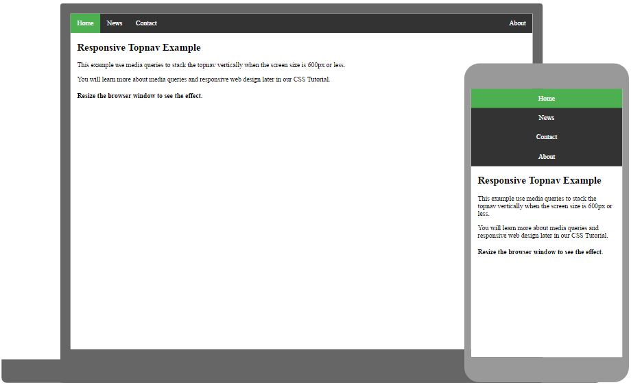
Responsive Sidenav
How to use CSS media queries to create a responsive side navigation.
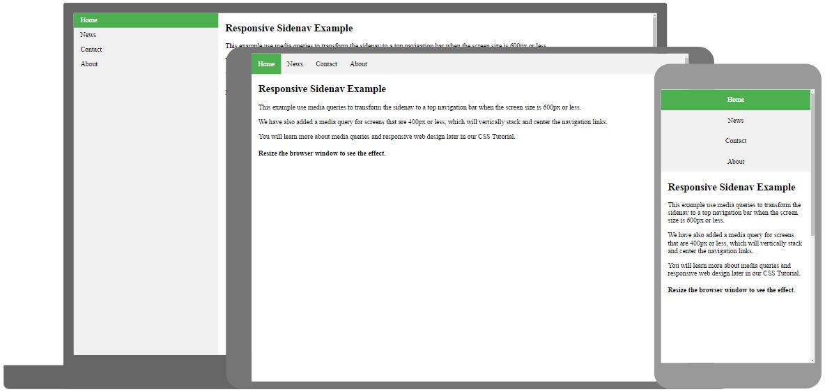
Dropdown Navbar
How to add a dropdown menu inside a navigation bar.
CSS Dropdowns
Demo: Dropdown Examples
Move the mouse over the examples below:
Basic Dropdown
Create a dropdown box that appears when the user moves the mouse over an element.
Example
<style>
.dropdown {
position: relative;
display: inline-block;
}
.dropdown-content {
display: none;
position: absolute;
background-color: #f9f9f9;
min-width: 160px;
box-shadow: 0px 8px 16px 0px rgba(0,0,0,0.2);
padding: 12px 16px;
z-index: 1;
}
.dropdown:hover .dropdown-content {
display: block;
}
</style>
<div class="dropdown">
<span>Mouse over me</span>
<div class="dropdown-content">
<p>Hello World!</p>
</div>
</div>Example Explained
HTML) Use any element to open the dropdown content, e.g. a <span>, or a <button> element.
Use a container element (like <div>) to create the dropdown content and add whatever you want inside of it.
Wrap a <div> element around the elements to position the dropdown content correctly with CSS.
CSS) The .dropdown class uses position:relative, which is needed when we want the dropdown content to be placed right below the dropdown button (using position:absolute).
The .dropdown-content class holds the actual dropdown content. It is hidden by default, and will be displayed on hover (see below). Note the min-width is set to 160px. Feel free to change this. Tip: If you want the width of the dropdown content to be as wide as the dropdown button, set the width to 100% (and overflow:auto to enable scroll on small screens).
Instead of using a border, we have used the CSS box-shadow property to make the dropdown menu look like a "card".
The :hover selector is used to show the dropdown menu when the user moves the mouse over the dropdown button.
Dropdown Menu
Create a dropdown menu that allows the user to choose an option from a list:
This example is similar to the previous one, except that we add links inside the dropdown box and style them to fit a styled dropdown button:
Example
<style>
/* Style The Dropdown Button */
.dropbtn {
background-color: #4CAF50;
color: white;
padding: 16px;
font-size: 16px;
border: none;
cursor: pointer;
}
/* The container <div> - needed to position the dropdown content */
.dropdown {
position: relative;
display: inline-block;
}
/* Dropdown Content (Hidden by Default) */
.dropdown-content {
display: none;
position: absolute;
background-color: #f9f9f9;
min-width: 160px;
box-shadow: 0px 8px 16px 0px rgba(0,0,0,0.2);
z-index: 1;
}
/* Links inside the dropdown */
.dropdown-content a {
color: black;
padding: 12px 16px;
text-decoration: none;
display: block;
}
/* Change color of dropdown links on hover */
.dropdown-content a:hover {background-color: #f1f1f1}
/* Show the dropdown menu on hover */
.dropdown:hover .dropdown-content {
display: block;
}
/* Change the background color of the dropdown button when the dropdown content is shown */
.dropdown:hover .dropbtn {
background-color: #3e8e41;
}
</style>
<div class="dropdown">
<button class="dropbtn">Dropdown</button>
<div class="dropdown-content">
<a href="#">Link 1</a>
<a href="#">Link 2</a>
<a href="#">Link 3</a>
</div>
</div>Right-aligned Dropdown Content
If you want the dropdown menu to go from right to left, instead of left to right, add right: 0;
Example
.dropdown-content {
right: 0;
}
More Examples
Dropdown Image
How to add an image and other content inside the dropdown box.
Hover over the image:
Dropdown Navbar
How to add a dropdown menu inside a navigation bar.
CSS Image Gallery
Image Gallery
The following image gallery is created with CSS:
Example
<html>
<head>
<style>
div.gallery {
margin: 5px;
border: 1px solid #ccc;
float: left;
width: 180px;
}
div.gallery:hover {
border: 1px solid #777;
}
div.gallery img {
width: 100%;
height: auto;
}
div.desc {
padding: 15px;
text-align: center;
}
</style>
</head>
<body>
<div class="gallery">
<a target="_blank" href="img_5terre.jpg">
<img src="img_5terre.jpg" alt="Cinque Terre" width="600" height="400">
</a>
<div class="desc">Add a description of the image here</div>
</div>
<div class="gallery">
<a target="_blank" href="img_forest.jpg">
<img src="img_forest.jpg" alt="Forest" width="600" height="400">
</a>
<div class="desc">Add a description of the image here</div>
</div>
<div class="gallery">
<a target="_blank" href="img_lights.jpg">
<img src="img_lights.jpg" alt="Northern Lights" width="600" height="400">
</a>
<div class="desc">Add a description of the image here</div>
</div>
<div class="gallery">
<a target="_blank" href="img_mountains.jpg">
<img src="img_mountains.jpg" alt="Mountains" width="600" height="400">
</a>
<div class="desc">Add a description of the image here</div>
</div>
</body>
</html>More Examples
Responsive Image Gallery
How to use CSS media queries to create a responsive image gallery that will look good on desktops, tablets and smart phones.
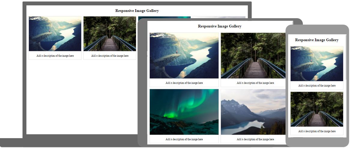
CSS Image Sprites
Image Sprites
An image sprite is a collection of images put into a single image.
A web page with many images can take a long time to load and generates multiple server requests.
Using image sprites will reduce the number of server requests and save bandwidth.
Image Sprites - Simple Example
Instead of using three separate images, we use this single image ("img_navsprites.gif"):
With CSS, we can show just the part of the image we need.
In the following example the CSS specifies which part of the "img_navsprites.gif" image to show:
Example
#home {
width: 46px;
height: 44px;
background: url(img_navsprites.gif) 0 0;
}Example explained:
<img id="home" src="img_trans.gif">- Only defines a small transparent image because the src attribute cannot be empty. The displayed image will be the background image we specify in CSSwidth: 46px; height: 44px;- Defines the portion of the image we want to usebackground: url(img_navsprites.gif) 0 0;- Defines the background image and its position (left 0px, top 0px)
This is the easiest way to use image sprites, now we want to expand it by using links and hover effects.
Image Sprites - Create a Navigation List
We want to use the sprite image ("img_navsprites.gif") to create a navigation list.
We will use an HTML list, because it can be a link and also supports a background image:
Example
#navlist {
position: relative;
}
#navlist li {
margin: 0;
padding: 0;
list-style: none;
position: absolute;
top: 0;
}
#navlist li, #navlist a {
height: 44px;
display: block;
}
#home {
left: 0px;
width: 46px;
background: url('img_navsprites.gif') 0 0;
}
#prev {
left: 63px;
width: 43px;
background: url('img_navsprites.gif') -47px 0;
}
#next {
left: 129px;
width: 43px;
background: url('img_navsprites.gif') -91px 0;
}Example explained:
#navlist {position:relative;}- position is set to relative to allow absolute positioning inside it#navlist li {margin:0;padding:0;list-style:none;position:absolute;top:0;}- margin and padding are set to 0, list-style is removed, and all list items are absolute positioned#navlist li, #navlist a {height:44px;display:block;}- the height of all the images is 44px
Now start to position and style for each specific part:
#home {left:0px;width:46px;}- Positioned all the way to the left, and the width of the image is 46px#home {background:url(img_navsprites.gif) 0 0;}- Defines the background image and its position (left 0px, top 0px)#prev {left:63px;width:43px;}- Positioned 63px to the right (#home width 46px + some extra space between items), and the width is 43px#prev {background:url('img_navsprites.gif') -47px 0;}- Defines the background image 47px to the right (#home width 46px + 1px line divider)#next {left:129px;width:43px;}- Positioned 129px to the right (start of #prev is 63px + #prev width 43px + extra space), and the width is 43px#next {background:url('img_navsprites.gif') -91px 0;}- Defines the background image 91px to the right (#home width 46px + 1px line divider + #prev width 43px + 1px line divider)
Image Sprites - Hover Effect
Now we want to add a hover effect to our navigation list.
Tip: The :hover selector can be used on all elements, not only on links.
Our new image ("img_navsprites_hover.gif") contains three navigation images and three images to use for hover effects:
Because this is one single image, and not six separate files, there will be no loading delay when a user hovers over the image.
We only add three lines of code to add the hover effect:
Example
#home a:hover {
background: url('img_navsprites_hover.gif') 0 -45px;
}
#prev a:hover {
background: url('img_navsprites_hover.gif') -47px -45px;
}
#next a:hover {
background: url('img_navsprites_hover.gif') -91px -45px;
}CSS Attribute Selectors
Style HTML Elements With Specific Attributes
It is possible to style HTML elements that have specific attributes or attribute values.
CSS [attribute] Selector
The [attribute] selector is used to select elements with a specified attribute.
The following example selects all <a> elements with a target attribute:
Example
a[target] {
background-color: yellow;
}CSS [attribute="value"] Selector
The [attribute="value"] selector is used to select elements with a specified attribute and value.
The following example selects all <a> elements with a target="_blank" attribute:
Example
a[target="_blank"] {
background-color: yellow;
}CSS [attribute~="value"] Selector
The [attribute~="value"] selector is used to select elements with an attribute value containing a specified word.
The following example selects all elements with a title attribute that contains a space-separated list of words, one of which is "flower":
Example
[title~="flower"] {
border: 5px solid yellow;
}The example above will match elements with title="flower", title="summer flower", and title="flower new", but not title="my-flower" or title="flowers".
CSS [attribute|="value"] Selector
The [attribute|="value"] selector is used to select elements with the specified attribute, whose value can be exactly the specified value, or the specified value followed by a hyphen (-).
Note: The value has to be a whole word, either alone, like class="top", or followed by a hyphen( - ), like class="top-text".
Example
[class|="top"] {
background: yellow;
}CSS [attribute^="value"] Selector
The [attribute^="value"] selector is used to select elements with the specified attribute, whose value starts with the specified value.
The following example selects all elements with a class attribute value that starts with "top":
Note: The value does not have to be a whole word!
Example
[class^="top"] {
background: yellow;
}CSS [attribute$="value"] Selector
The [attribute$="value"] selector is used to select elements whose attribute value ends with a specified value.
The following example selects all elements with a class attribute value that ends with "test":
Note: The value does not have to be a whole word!
Example
[class$="test"] {
background: yellow;
}CSS [attribute*="value"] Selector
The [attribute*="value"] selector is used to select elements whose attribute value contains a specified value.
The following example selects all elements with a class attribute value that contains "te":
Note: The value does not have to be a whole word!
Example
[class*="te"] {
background: yellow;
}Styling Forms
The attribute selectors can be useful for styling forms without class or ID:
Example
input[type="text"] {
width: 150px;
display: block;
margin-bottom: 10px;
background-color: yellow;
}
input[type="button"] {
width: 120px;
margin-left: 35px;
display: block;
}CSS Forms
Styling Input Fields
Use the width property to determine the width of the input field:
Example
input {
width: 100%;
}The example above applies to all <input> elements. If you only want to style a specific input type, you can use attribute selectors:
input[type=text]- will only select text fieldsinput[type=password]- will only select password fieldsinput[type=number]- will only select number fields- etc..
Padded Inputs
Use the padding property to add space inside the text field.
Tip: When you have many inputs after each other, you might also want to add some margin, to add more space outside of them:
Example
input[type=text] {
width: 100%;
padding: 12px 20px;
margin: 8px 0;
box-sizing: border-box;
}Note that we have set the box-sizing property to border-box. This makes sure that the padding and eventually borders are included in the total width and height of the elements.
Read more about the box-sizing property in our CSS Box Sizing chapter.
Bordered Inputs
Use the border property to change the border size and color, and use the border-radius property to add rounded corners:
Example
input[type=text] {
border: 2px solid red;
border-radius: 4px;
}If you only want a bottom border, use the border-bottom property:
Example
input[type=text] {
border: none;
border-bottom: 2px solid red;
}Colored Inputs
Use the background-color property to add a background color to the input, and the color property to change the text color:
Example
input[type=text] {
background-color: #3CBC8D;
color: white;
}Focused Inputs
By default, some browsers will add a blue outline around the input when it gets focus (clicked on). You can remove this behavior by adding outline: none; to the input.
Use the :focus selector to do something with the input field when it gets focus:
Example
input[type=text]:focus {
background-color: lightblue;
}Example
input[type=text]:focus {
border: 3px solid #555;
}Input with icon/image
If you want an icon inside the input, use the background-image property and position it with the background-position property. Also notice that we add a large left padding to reserve the space of the icon:
Example
input[type=text] {
background-color: white;
background-image: url('searchicon.png');
background-position: 10px 10px;
background-repeat: no-repeat;
padding-left: 40px;
}Animated Search Input
In this example we use the CSS transition property to animate the width of the search input when it gets focus. You will learn more about the transition property later, in our CSS Transitions chapter.
Example
input[type=text] {
transition: width 0.4s ease-in-out;
}
input[type=text]:focus {
width: 100%;
}Styling Textareas
Tip: Use the resize property to prevent textareas from being resized (disable the "grabber" in the bottom right corner):
Example
textarea {
width: 100%;
height: 150px;
padding: 12px 20px;
box-sizing: border-box;
border: 2px solid #ccc;
border-radius: 4px;
background-color: #f8f8f8;
resize: none;
}Styling Select Menus
Example
select {
width: 100%;
padding: 16px 20px;
border: none;
border-radius: 4px;
background-color: #f1f1f1;
}Styling Input Buttons
Example
input[type=button], input[type=submit], input[type=reset] {
background-color: #04AA6D;
border: none;
color: white;
padding: 16px 32px;
text-decoration: none;
margin: 4px 2px;
cursor: pointer;
}
/* Tip: use width: 100% for full-width buttons */For more information about how to style buttons with CSS, read our CSS Buttons Tutorial.
Responsive Form
Resize the browser window to see the effect. When the screen is less than 600px wide, make the two columns stack on top of each other instead of next to each other.
Advanced: The following example uses media queries to create a responsive form. You will learn more about this in a later chapter.
CSS Counters
Pizza
Hamburger
Hotdogs
CSS counters are "variables" maintained by CSS whose values can be incremented by CSS rules (to track how many times they are used). Counters let you adjust the appearance of content based on its placement in the document.
Automatic Numbering With Counters
CSS counters are like "variables". The variable values can be incremented by CSS rules (which will track how many times they are used).
To work with CSS counters we will use the following properties:
counter-reset- Creates or resets a countercounter-increment- Increments a counter valuecontent- Inserts generated contentcounter()orcounters()function - Adds the value of a counter to an element
To use a CSS counter, it must first be created with counter-reset.
The following example creates a counter for the page (in the body selector), then increments the counter value for each <h2> element and adds "Section <value of the counter>:" to the beginning of each <h2> element:
Example
body {
counter-reset: section;
}
h2::before {
counter-increment: section;
content: "Section " counter(section) ": ";
}Nesting Counters
The following example creates one counter for the page (section) and one counter for each <h1> element (subsection). The "section" counter will be counted for each <h1> element with "Section <value of the section counter>.", and the "subsection" counter will be counted for each <h2> element with "<value of the section counter>.<value of the subsection counter>":
Example
body {
counter-reset: section;
}
h1 {
counter-reset: subsection;
}
h1::before {
counter-increment: section;
content: "Section " counter(section) ". ";
}
h2::before {
counter-increment: subsection;
content: counter(section) "." counter(subsection) " ";
}A counter can also be useful to make outlined lists because a new instance of a counter is automatically created in child elements. Here we use the counters() function to insert a string between different levels of nested counters:
Example
ol {
counter-reset: section;
list-style-type: none;
}
li::before {
counter-increment: section;
content: counters(section,".") " ";
}CSS Counter Properties
| Property | Description |
|---|---|
| content | Used with the ::before and ::after pseudo-elements, to insert generated content |
| counter-increment | Increments one or more counter values |
| counter-reset | Creates or resets one or more counters |
| counter() | Returns the current value of the named counter |
CSS Website Layout
Website Layout
A website is often divided into headers, menus, content and a footer:
There are tons of different layout designs to choose from. However, the structure above, is one of the most common, and we will take a closer look at it in this tutorial.
Header
A header is usually located at the top of the website (or right below a top navigation menu). It often contains a logo or the website name:
Example
.header {
background-color: #F1F1F1;
text-align: center;
padding: 20px;
}Result
Header
Navigation Bar
A navigation bar contains a list of links to help visitors navigating through your website:
Example
/* The navbar container */
.topnav {
overflow: hidden;
background-color: #333;
}
/* Navbar links */
.topnav a {
float: left;
display: block;
color: #f2f2f2;
text-align: center;
padding: 14px 16px;
text-decoration: none;
}
/* Links - change color on hover */
.topnav a:hover {
background-color: #ddd;
color: black;
}Result
Content
The layout in this section, often depends on the target users. The most common layout is one (or combining them) of the following:
- 1-column (often used for mobile browsers)
- 2-column (often used for tablets and laptops)
- 3-column layout (only used for desktops)
1-column:
2-column:
3-column:
We will create a 3-column layout, and change it to a 1-column layout on smaller screens:
Example
/* Create three equal columns that float next to each other */
.column {
float: left;
width: 33.33%;
}
/* Clear floats after the columns */
.row:after {
content: "";
display: table;
clear: both;
}
/* Responsive layout - makes the three columns stack on top of each other instead of next to each other on smaller screens (600px wide or less) */
@media screen and (max-width: 600px) {
.column {
width: 100%;
}
}Result
Column
Lorem ipsum dolor sit amet, consectetur adipiscing elit. Maecenas sit amet pretium urna. Vivamus venenatis velit nec neque ultricies, eget elementum magna tristique.
Column
Lorem ipsum dolor sit amet, consectetur adipiscing elit. Maecenas sit amet pretium urna. Vivamus venenatis velit nec neque ultricies, eget elementum magna tristique.
Column
Lorem ipsum dolor sit amet, consectetur adipiscing elit. Maecenas sit amet pretium urna. Vivamus venenatis velit nec neque ultricies, eget elementum magna tristique.
Tip: To create a 2-column layout, change the width to 50%. To create a 4-column layout, use 25%, etc.
Tip: Do you wonder how the @media rule works? Read more about it in our CSS Media Queries chapter.
Tip: A more modern way of creating column layouts, is to use CSS Flexbox. However, it is not supported in Internet Explorer 10 and earlier versions. If you require IE6-10 support, use floats (as shown above).
To learn more about the Flexible Box Layout Module, read our CSS Flexbox chapter.
Unequal Columns
The main content is the biggest and the most important part of your site.
It is common with unequal column widths, so that most of the space is reserved for the main content. The side content (if any) is often used as an alternative navigation or to specify information relevant to the main content. Change the widths as you like, only remember that it should add up to 100% in total:
Example
.column {
float: left;
}
/* Left and right column */
.column.side {
width: 25%;
}
/* Middle column */
.column.middle {
width: 50%;
}
/* Responsive layout - makes the three columns stack on top of each other instead of next to each other */
@media screen and (max-width: 600px) {
.column.side, .column.middle {
width: 100%;
}
}Result
Side
Lorem ipsum dolor sit amet, consectetur adipiscing elit...
Main Content
Lorem ipsum dolor sit amet, consectetur adipiscing elit. Maecenas sit amet pretium urna. Vivamus venenatis velit nec neque ultricies, eget elementum magna tristique. Quisque vehicula, risus eget aliquam placerat, purus leo tincidunt eros, eget luctus quam orci in velit. Praesent scelerisque tortor sed accumsan convallis.
Side
Lorem ipsum dolor sit amet, consectetur adipiscing elit...
Footer
The footer is placed at the bottom of your page. It often contains information like copyright and contact info:
Example
.footer {
background-color: #F1F1F1;
text-align: center;
padding: 10px;
}Result
Responsive Website Layout
By using some of the CSS code above, we have created a responsive website layout, which varies between two columns and full-width columns depending on screen width:
CSS Units
CSS has several different units for expressing a length.
Many CSS properties take "length" values, such as width, margin, padding, font-size, etc.
Length is a number followed by a length unit, such as 10px, 2em, etc.
Example
Set different length values, using px (pixels):
h1 {
font-size: 60px;
}
p {
font-size: 25px;
line-height: 50px;
}What is Specificity?
If there are two or more CSS rules that point to the same element, the selector with the highest specificity value will "win", and its style declaration will be applied to that HTML element.
Think of specificity as a score/rank that determines which style declaration is ultimately applied to an element.
Look at the following examples:
Example 1
In this example, we have used the "p" element as selector, and specified a red color for this element. The text will be red:
<html>
<head>
<style>
p {color: red;}
</style>
</head>
<body>
<p>Hello World!</p>
</body>
</html>Now, look at example 2:
Example 2
In this example, we have added a class selector (named "test"), and specified a green color for this class. The text will now be green (even though we have specified a red color for the element selector "p"). This is because the class selector is given higher priority:
<html>
<head>
<style>
.test {color: green;}
p {color: red;}
</style>
</head>
<body>
<p class="test">Hello World!</p>
</body>
</html>Now, look at example 3:
Example 3
In this example, we have added the id selector (named "demo"). The text will now be blue, because the id selector is given higher priority:
<html>
<head>
<style>
#demo {color: blue;}
.test {color: green;}
p {color: red;}
</style>
</head>
<body>
<p id="demo" class="test">Hello World!</p>
</body>
</html>Now, look at example 4:
Example 4
In this example, we have added an inline style for the "p" element. The text will now be pink, because the inline style is given the highest priority:
<html>
<head>
<style>
#demo {color: blue;}
.test {color: green;}
p {color: red;}
</style>
</head>
<body>
<p id="demo" class="test" style="color: pink;">Hello World!</p>
</body>
</html>Specificity Hierarchy
Every CSS selector has its place in the specificity hierarchy.
There are four categories which define the specificity level of a selector:
- Inline styles - Example: <h1 style="color: pink;">
- IDs - Example: #navbar
- Classes, pseudo-classes, attribute selectors - Example: .test, :hover, [href]
- Elements and pseudo-elements - Example: h1, ::before
How to Calculate Specificity?
Memorize how to calculate specificity!
Start at 0, add 100 for each ID value, add 10 for each class value (or pseudo-class or attribute selector), add 1 for each element selector or pseudo-element.
Note: Inline style gets a specificity value of 1000, and is always given the highest priority!
Note 2: There is one exception to this rule: if you use the !important rule, it will even override inline styles!
The table below shows some examples on how to calculate specificity values:
| Selector | Specificity Value | Calculation |
|---|---|---|
| p | 1 | 1 |
| p.test | 11 | 1 + 10 |
| p#demo | 101 | 1 + 100 |
| <p style="color: pink;"> | 1000 | 1000 |
| #demo | 100 | 100 |
| .test | 10 | 10 |
| p.test1.test2 | 21 | 1 + 10 + 10 |
| #navbar p#demo | 201 | 100 + 1 + 100 |
| * | 0 | 0 (the universal selector is ignored) |
The selector with the highest specificity value will win and take effect!
Consider these three code fragments:
Example
A: h1
B: h1#content
C: <h1 id="content" style="color: pink;">Heading</h1>The specificity of A is 1 (one element selector)
The specificity of B is 101 (one ID reference + one element selector)
The specificity of C is 1000 (inline styling)
Since the third rule (C) has the highest specificity value (1000), this style declaration will be applied.
More Specificity Rules Examples
Equal specificity: the latest rule wins - If the same rule is written twice into the external style sheet, then the latest rule wins:
Example
h1 {background-color: yellow;}
h1 {background-color: red;}ID selectors have a higher specificity than attribute selectors - Look at the following three code lines:
Example
div#a {background-color: green;}
#a {background-color: yellow;}
div[id=a] {background-color: blue;}the first rule is more specific than the other two, and will therefore be applied.
Contextual selectors are more specific than a single element selector - The embedded style sheet is closer to the element to be styled. So in the following situation
Example
From external CSS file:
#content h1 {background-color: red;}
In HTML file:
<style>
#content h1 {background-color: yellow;}
</style>the latter rule will be applied.
A class selector beats any number of element selectors - a class selector such as .intro beats h1, p, div, etc:
Example
.intro {background-color: yellow;}
h1 {background-color: red;}The universal selector (*) and inherited values have a specificity of 0 - The universal selector (*) and inherited values are ignored!
What is !important?
The !important rule in CSS is used to add more importance to a property/value than normal.
In fact, if you use the !important rule, it will override ALL previous styling rules for that specific property on that element!
Let us look at an example:
Example
#myid {
background-color: blue;
}
.myclass {
background-color: gray;
}
p {
background-color: red !important;
}Example Explained
In the example above. all three paragraphs will get a red background color, even though the ID selector and the class selector have a higher specificity. The !important rule overrides the background-color property in both cases.
Important About !important
The only way to override an !important rule is to include another !important rule on a declaration with the same (or higher) specificity in the source code - and here the problem starts! This makes the CSS code confusing and the debugging will be hard, especially if you have a large style sheet!
Here we have created a simple example. It is not very clear, when you look at the CSS source code, which color is considered most important:
Example
#myid {
background-color: blue !important;
}
.myclass {
background-color: gray !important;
}
p {
background-color: red !important;
}Tip: It is good to know about the !important rule. You might see it in some CSS source code. However, do not use it unless you absolutely have to.
Maybe One or Two Fair Uses of !important
One way to use !important is if you have to override a style that cannot be overridden in any other way. This could be if you are working on a Content Management System (CMS) and cannot edit the CSS code. Then you can set some custom styles to override some of the CMS styles.
Another way to use !important is: Assume you want a special look for all buttons on a page. Here, buttons are styled with a gray background color, white text, and some padding and border:
Example
.button {
background-color: #8c8c8c;
color: white;
padding: 5px;
border: 1px solid black;
}The look of a button can sometimes change if we put it inside another element with higher specificity, and the properties get in conflict. Here is an example of this:
Example
.button {
background-color: #8c8c8c;
color: white;
padding: 5px;
border: 1px solid black;
}
#myDiv a {
color: red;
background-color: yellow;
}To "force" all buttons to have the same look, no matter what, we can add the !important rule to the properties of the button, like this:
Example
.button {
background-color: #8c8c8c !important;
color: white !important;
padding: 5px !important;
border: 1px solid black !important;
}
#myDiv a {
color: red;
background-color: yellow;
}CSS Math Functions
The CSS math functions allow mathematical expressions to be used as property values. Here, we will explain the calc(), max() and min() functions.
The calc() Function
The calc() function performs a calculation to be used as the property value.
CSS Syntax
calc(expression)| Value | Description |
|---|---|
| expression | Required. A mathematical expression. The result will be used as the value. The following operators can be used: + - * / |
Let us look at an example:
Example
Use calc() to calculate the width of a <div> element:
#div1 {
position: absolute;
left: 50px;
width: calc(100% - 100px);
border: 1px solid black;
background-color: yellow;
padding: 5px;
}The max() Function
The max() function uses the largest value, from a comma-separated list of values, as the property value.
CSS Syntax
max(value1, value2, ...)| Value | Description |
|---|---|
| value1, value2, ... | Required. A list of comma-separated values - where the largest value is chosen |
Let us look at an example:
Example
Use max() to set the width of #div1 to whichever value is largest, 50% or 300px:
#div1 {
background-color: yellow;
height: 100px;
width: max(50%, 300px);
}The min() Function
The min() function uses the smallest value, from a comma-separated list of values, as the property value.
CSS Syntax
min(value1, value2, ...)| Value | Description |
|---|---|
| value1, value2, ... | Required. A list of comma-separated values - where the smallest value is chosen |
Let us look at an example:
Example
Use min() to set the width of #div1 to whichever value is smallest, 50% or 300px:
#div1 {
background-color: yellow;
height: 100px;
width: min(50%, 300px);
}All CSS Math Functions
| Function | Description |
|---|---|
| calc() | Allows you to perform calculations to determine CSS property values |
| max() | Uses the largest value, from a comma-separated list of values, as the property value |
| min() | Uses the smallest value, from a comma-separated list of values, as the property value |